METRO CARACAS
Caracas Metro: Subterranean Monumentality and Civic Space Architecture by Max Pedemonte, Mario Bemergui, Siso & Shaw, Gustavo Niño, and Gustavo Legórburu (1977–1983)
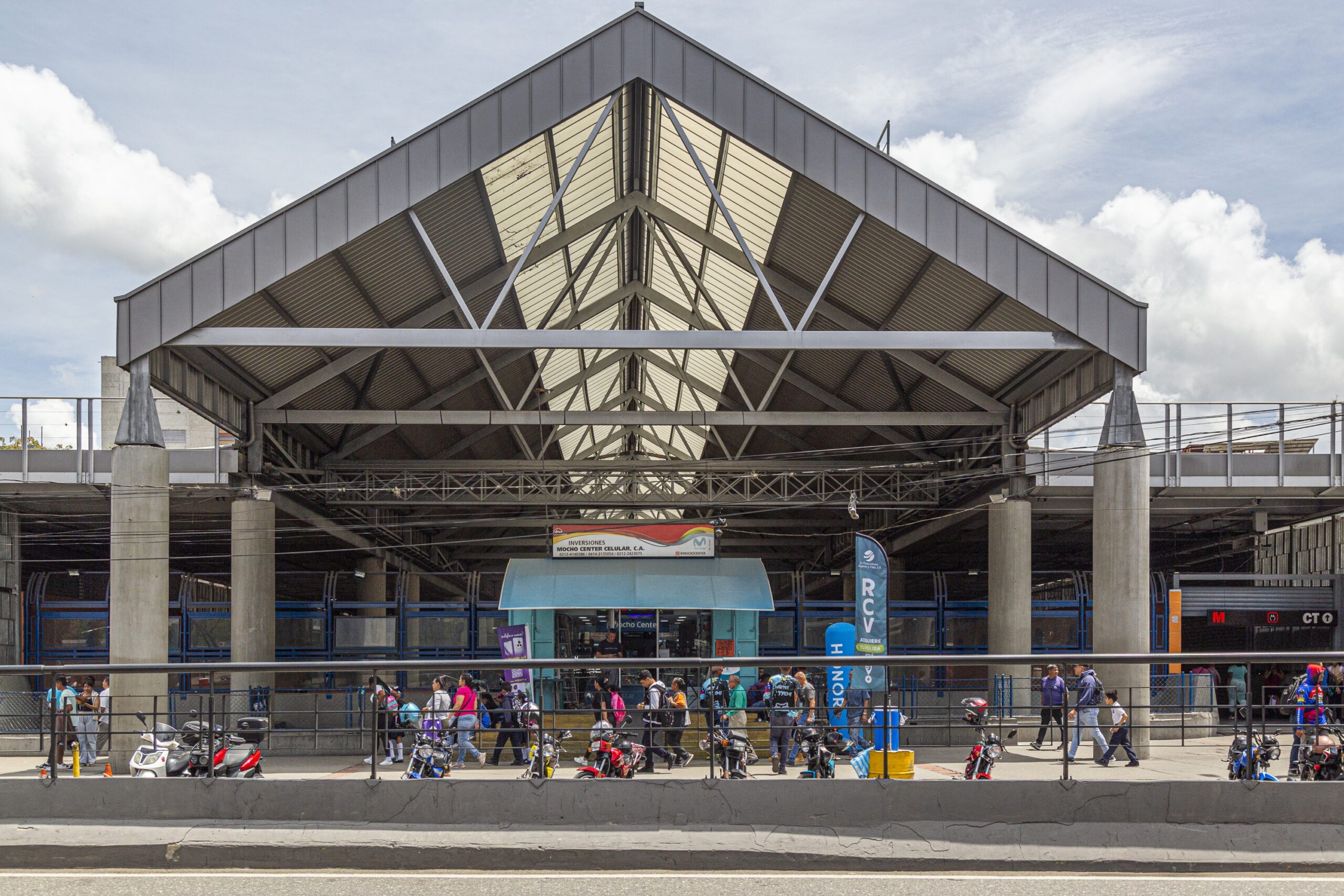
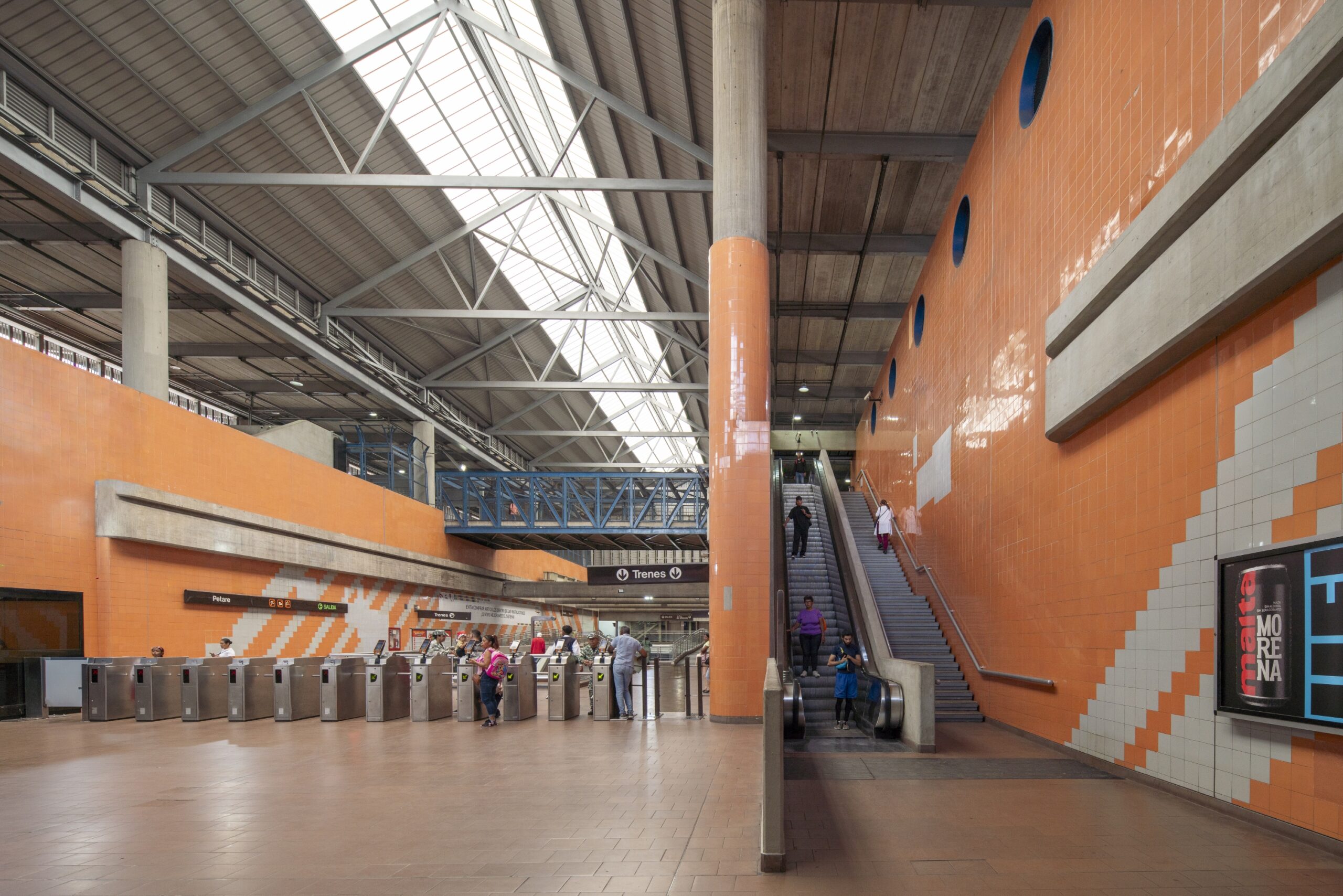
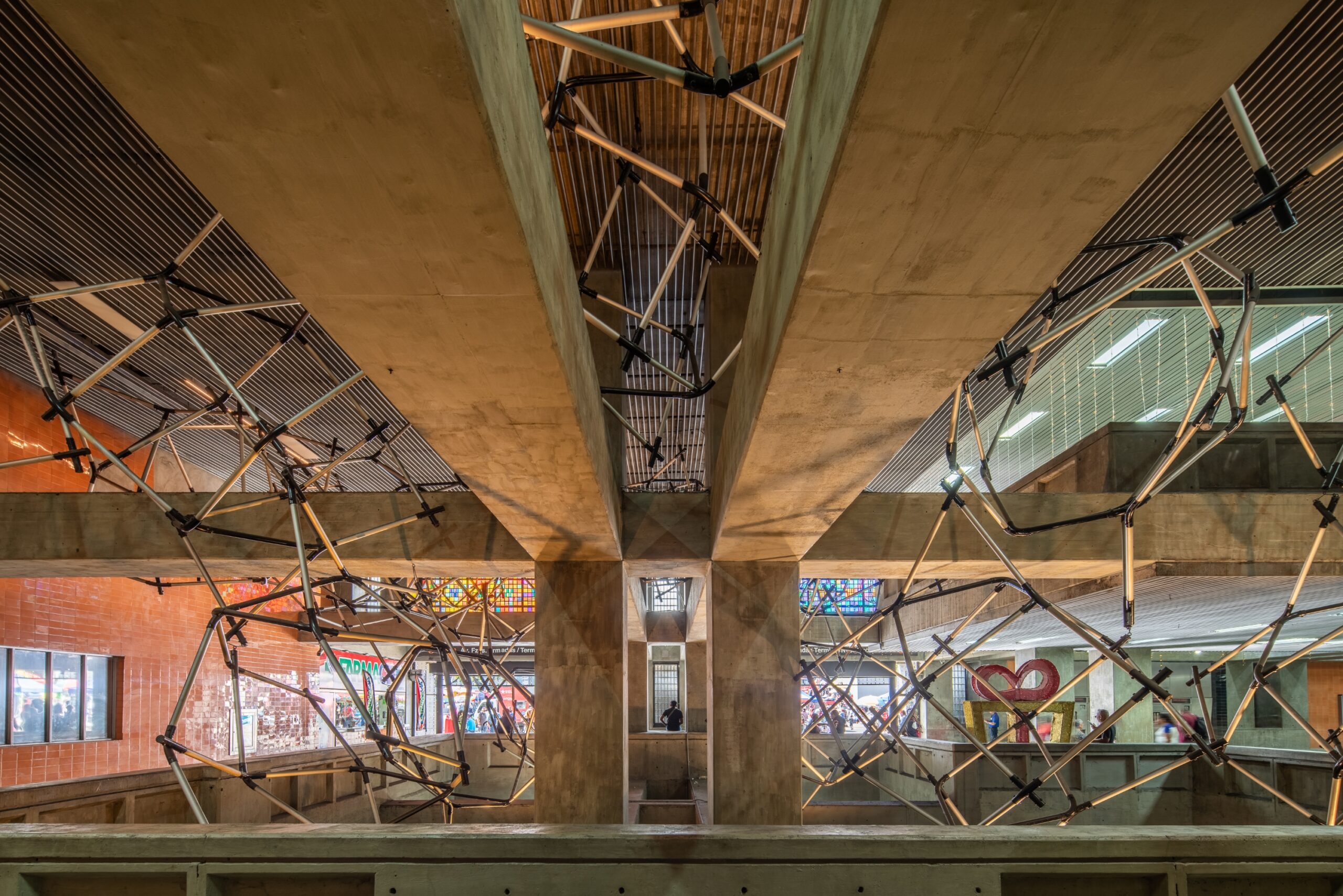
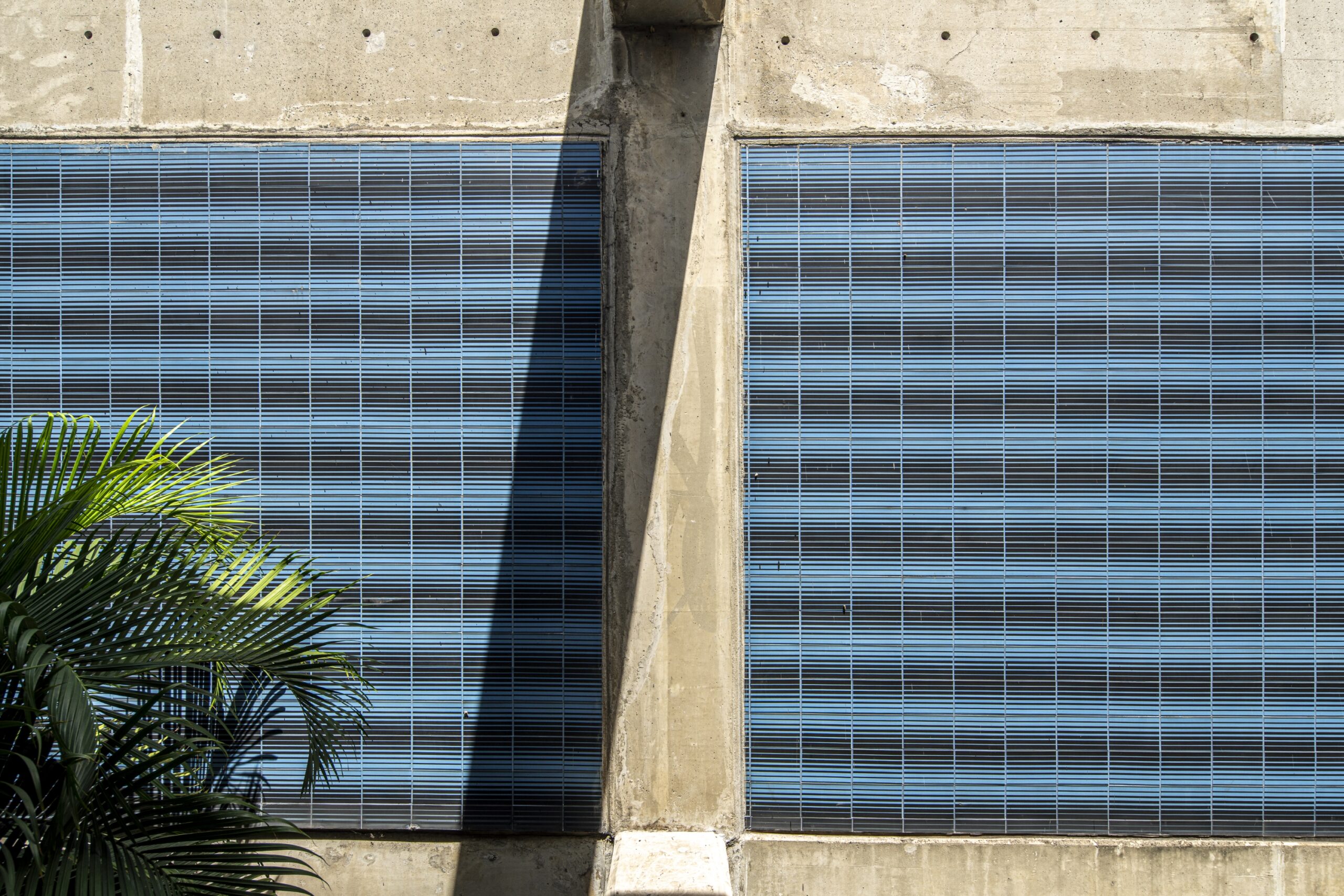
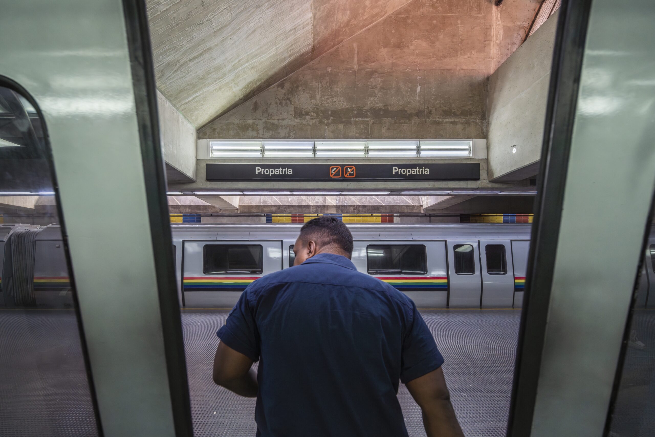
In 1977, the Compañía Anónima Metro de Caracas was created under the Ministry of Transport, and tunnel excavation began from Gato Negro towards Propatria. Its urban effects completely transformed the city, bringing new squares like La Hoyada or Petare; boulevards in Caricuao, Catia, and Sabana Grande; and a surge of road improvements, street furniture, and a new “metro culture.” As a child, I was lucky enough to witness it: one would go underground just to cool off in the stations’ air conditioning. The oil boom had turned Caracas into an economic hub akin to the Gulf monarchies; the city was overflowing with inhabitants and urgently needed a mass transit system. In this context, Paribas, a French bank seeking new markets, experimented with an export credit system in Venezuela: instead of lending dollars to the buying country, they financed French manufacturers with francs, who were reimbursed as the client paid in dollars. Thus, our “Saudi” metro was born. Today, there are no direct flights to Caracas, but in the 70s, the Concorde’s route included Maiquetía. Carlos Gómez designed the Europa Tower for the bank in El Rosal—resembling a tropical Andrault & Parat—just as the metro also features a brutalist language, a true image of its era.
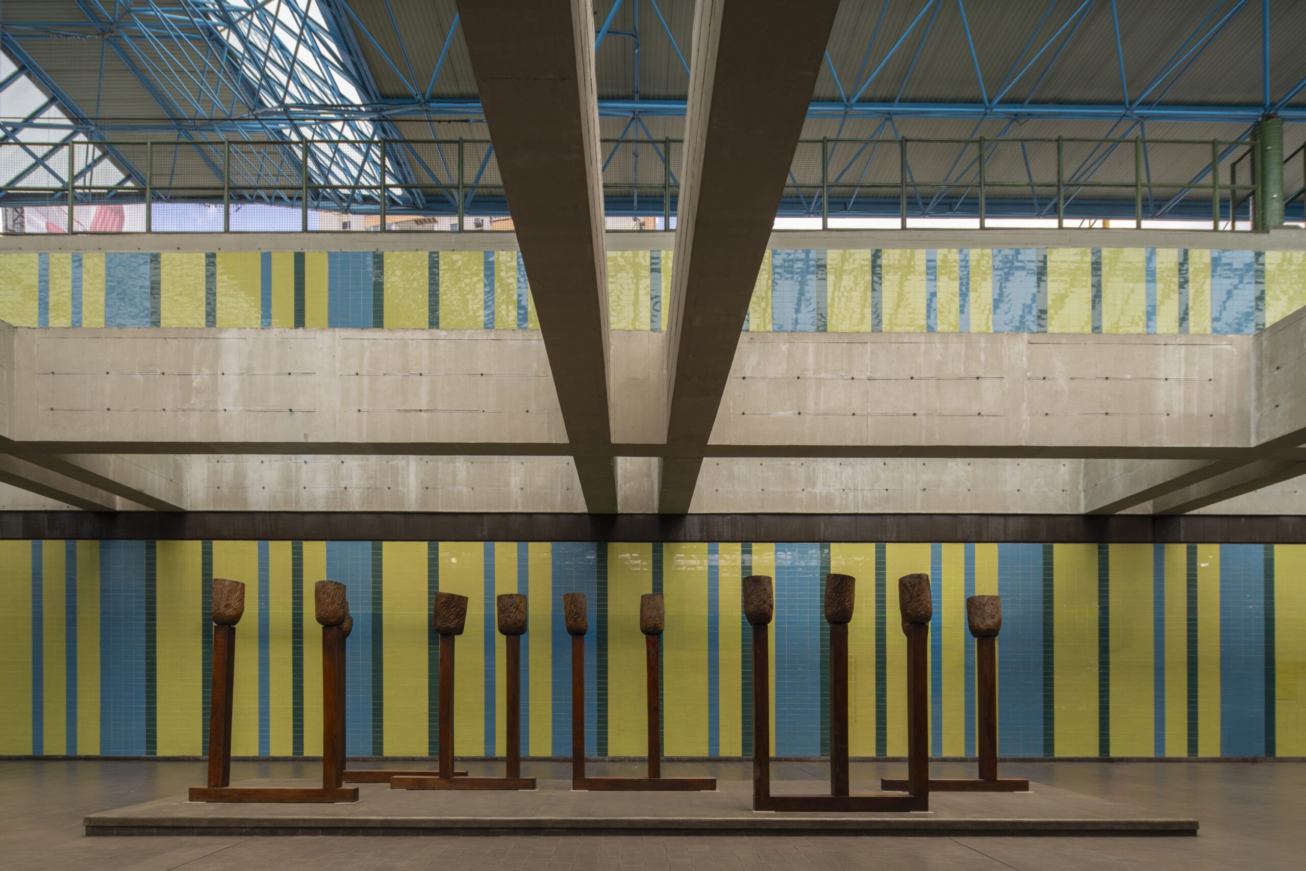
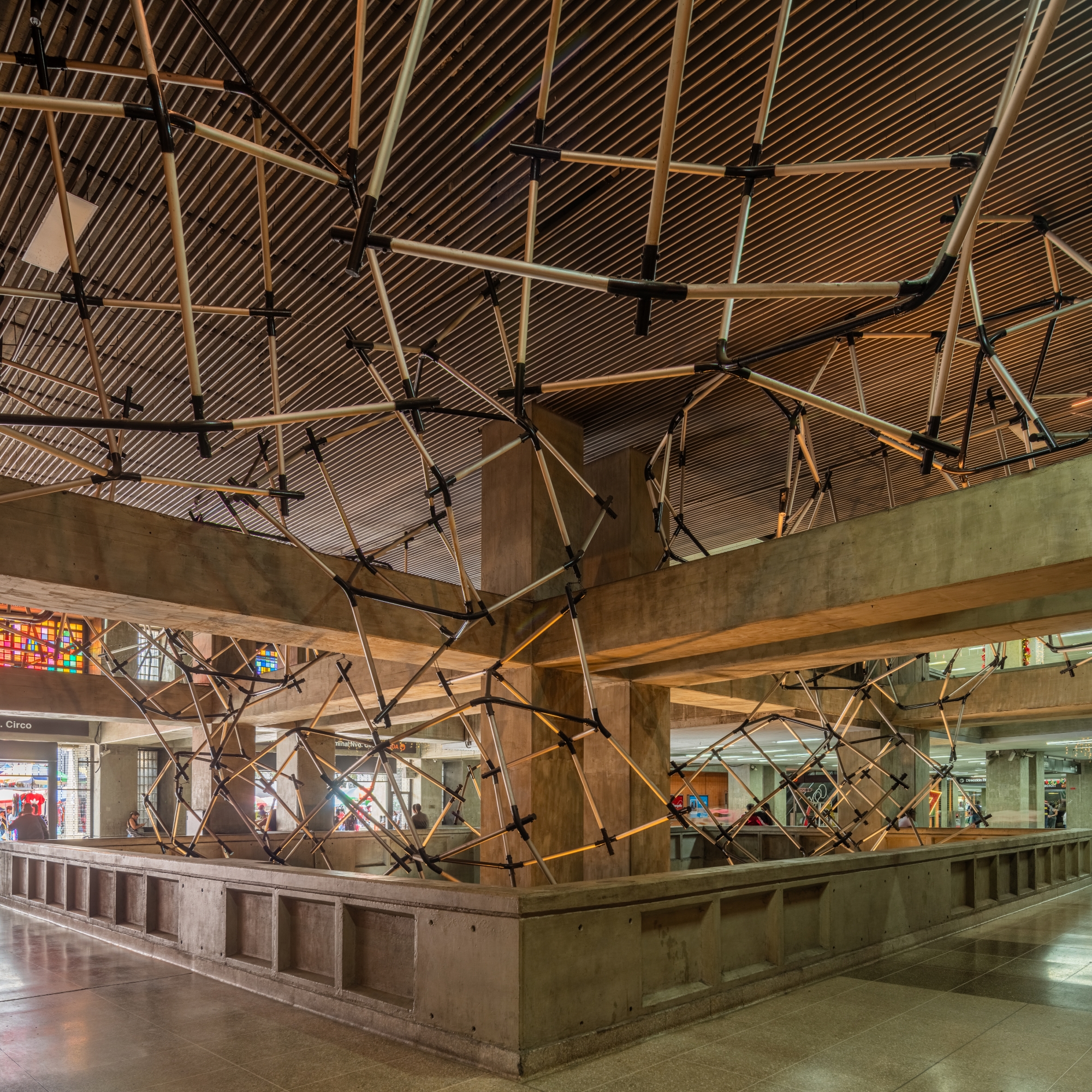
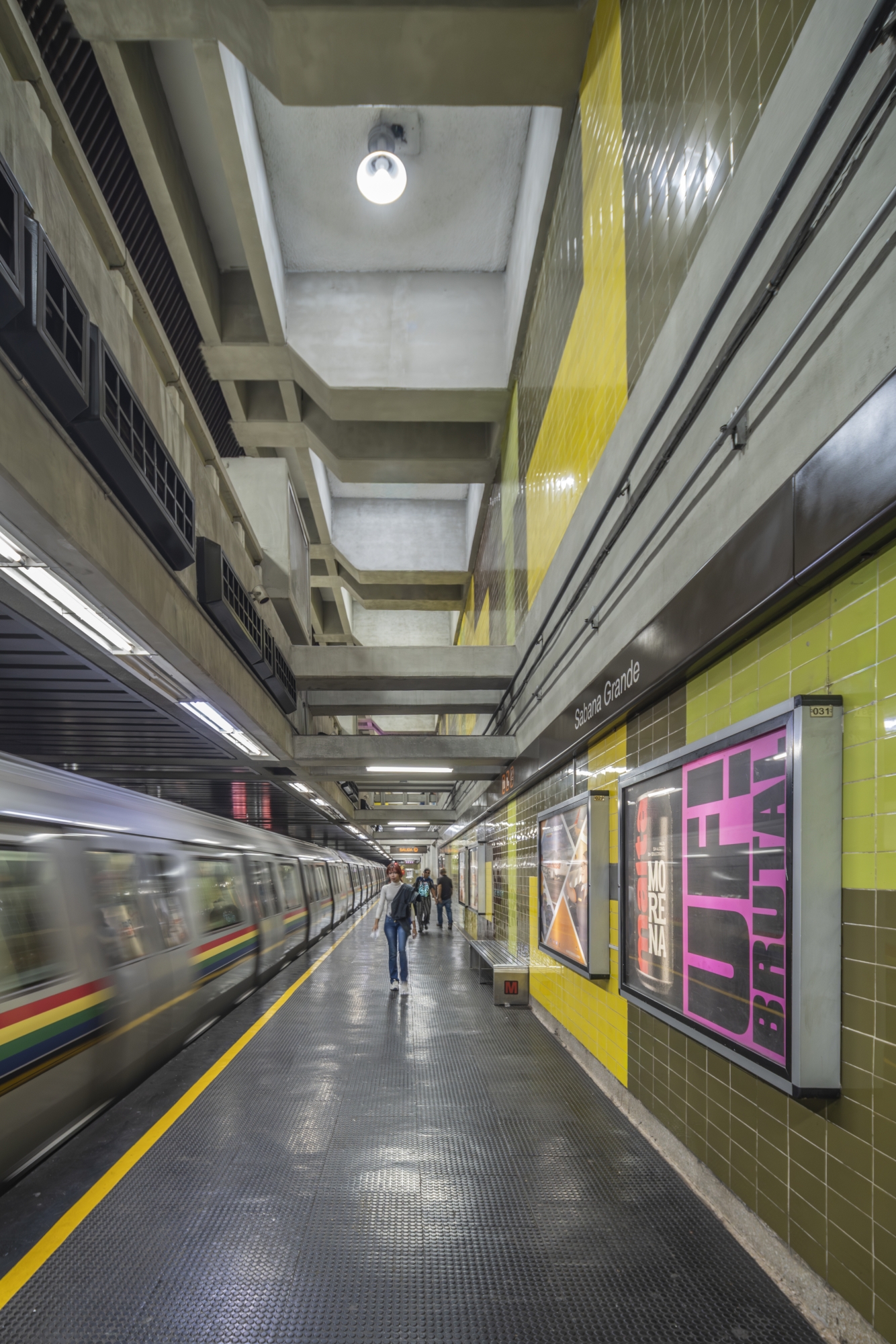
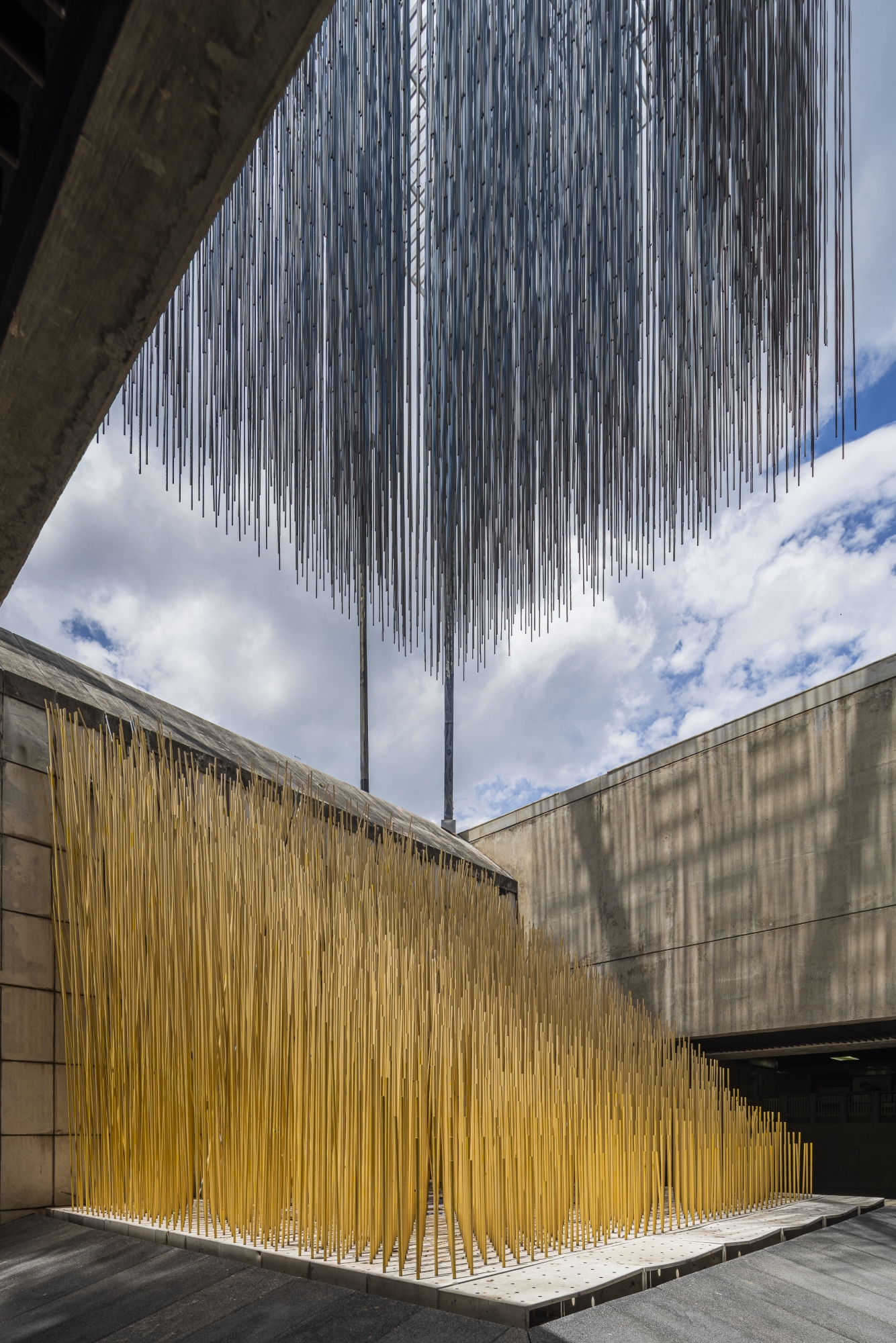
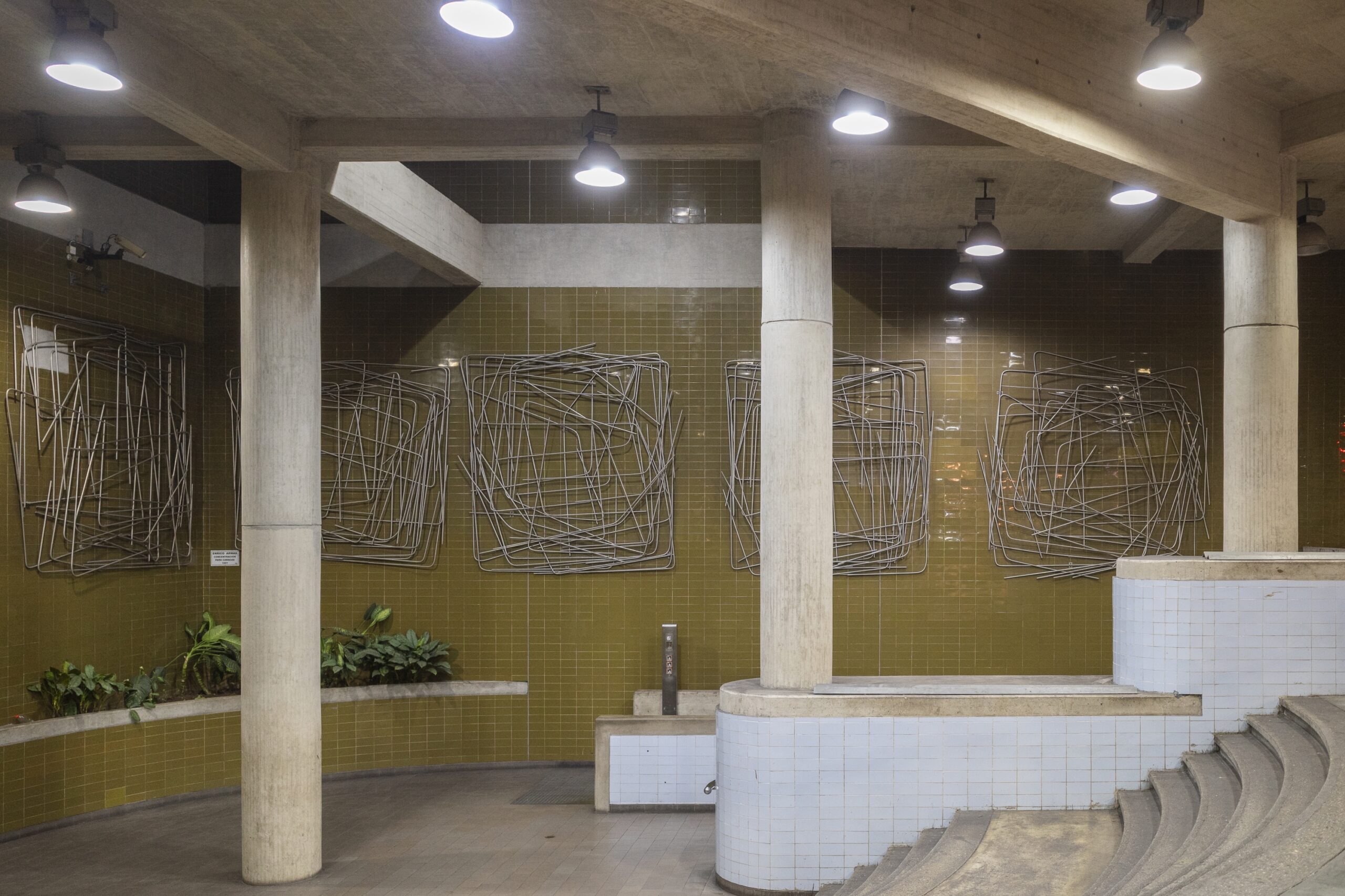
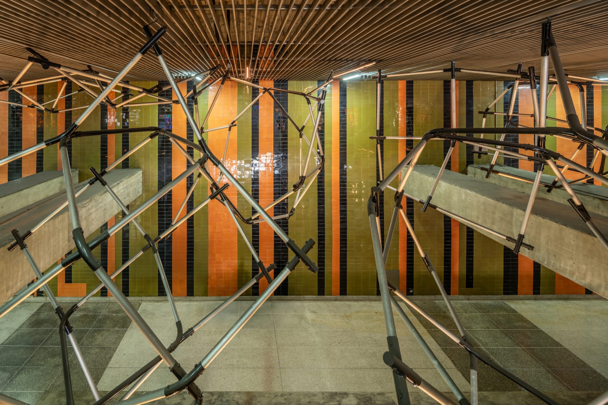
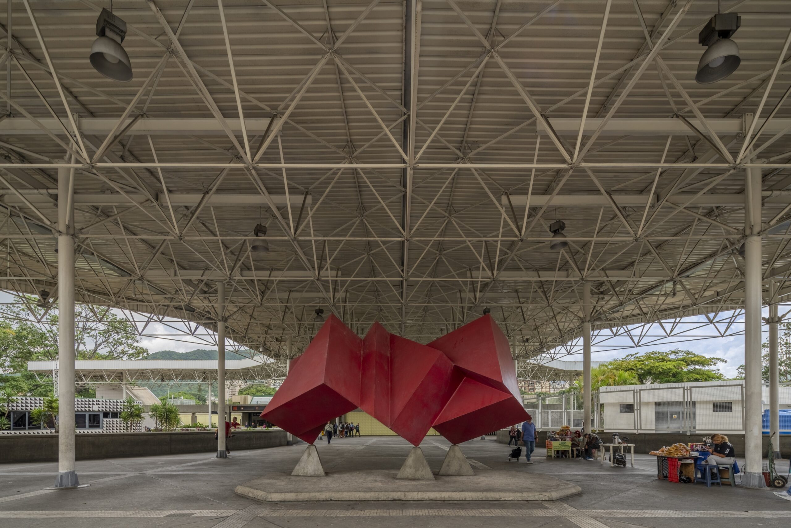
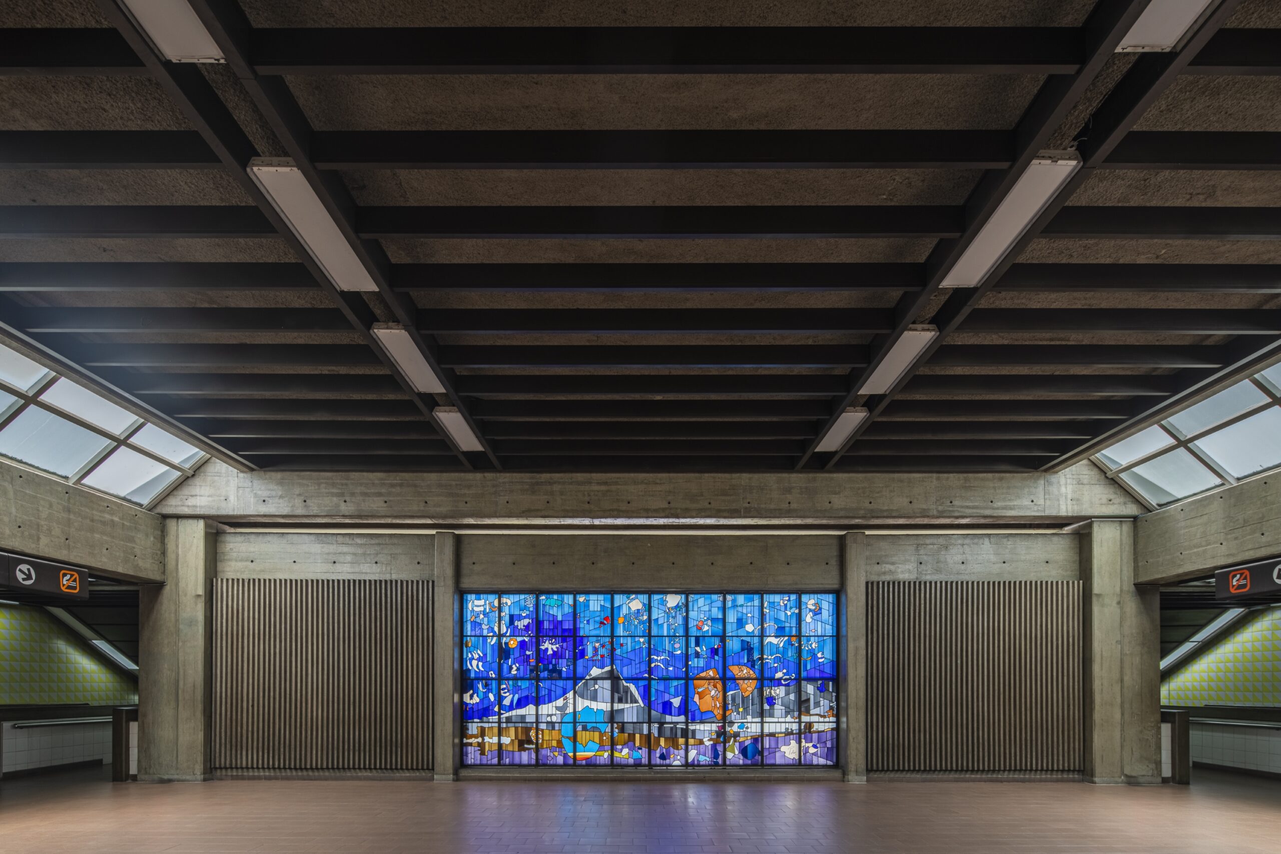
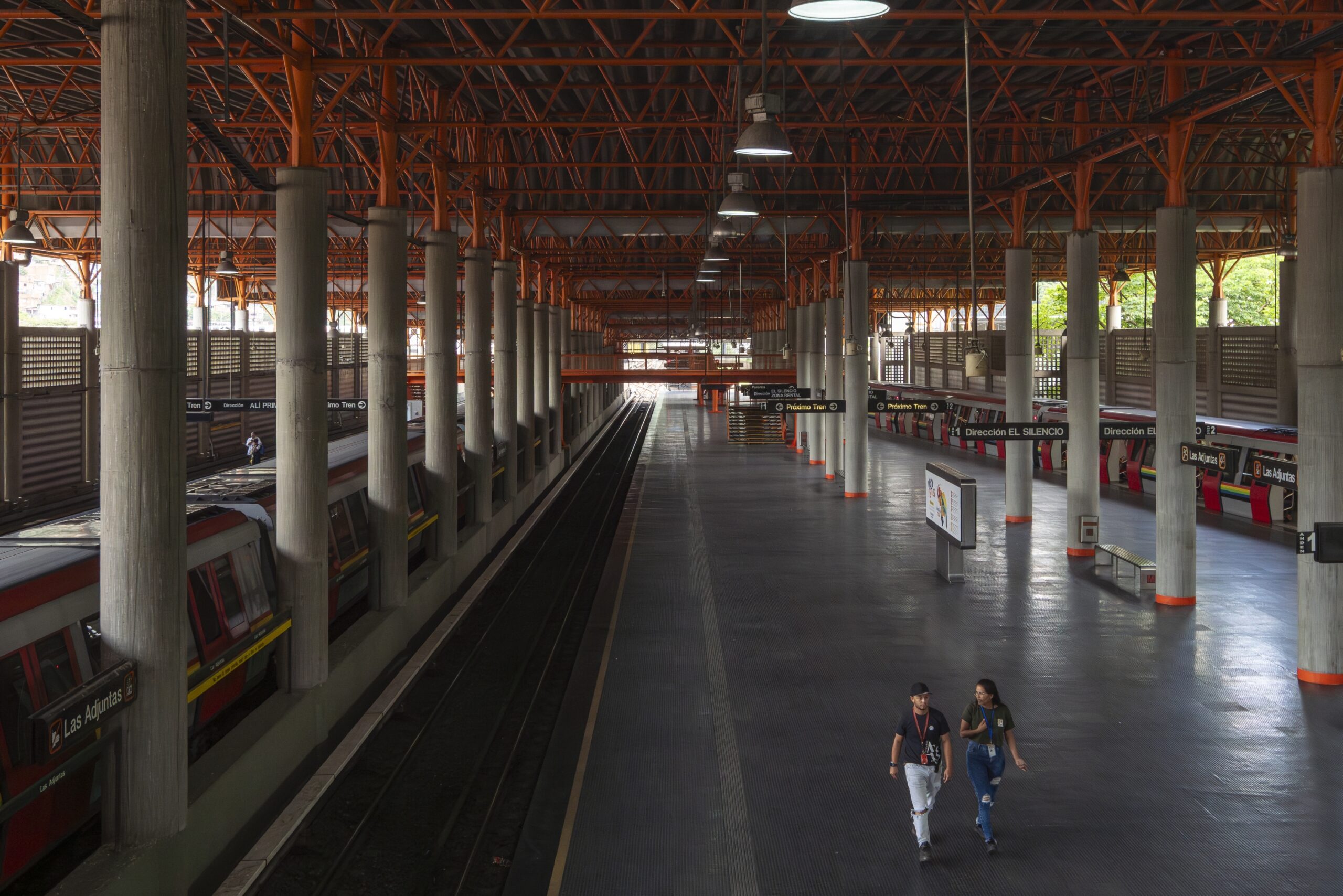
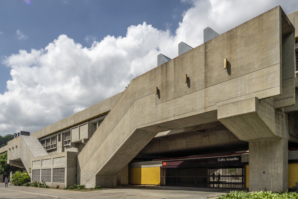
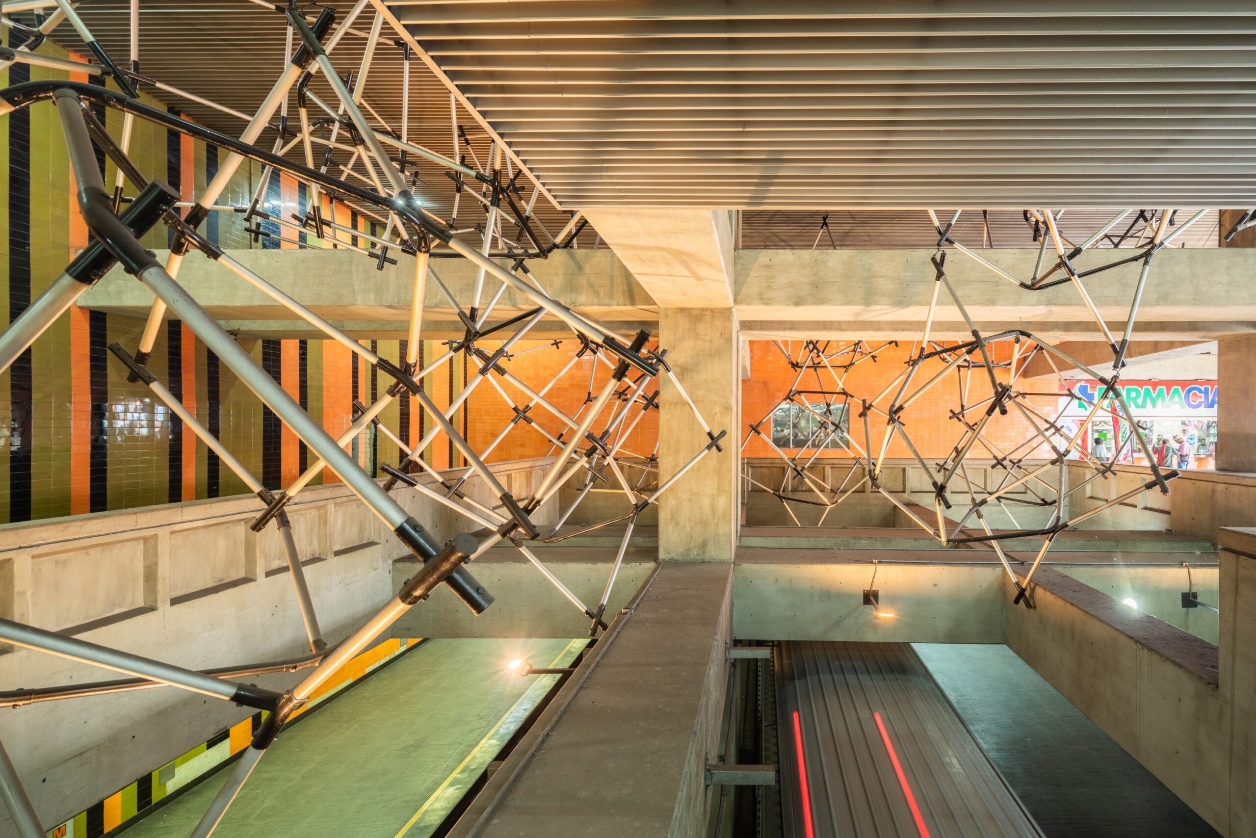
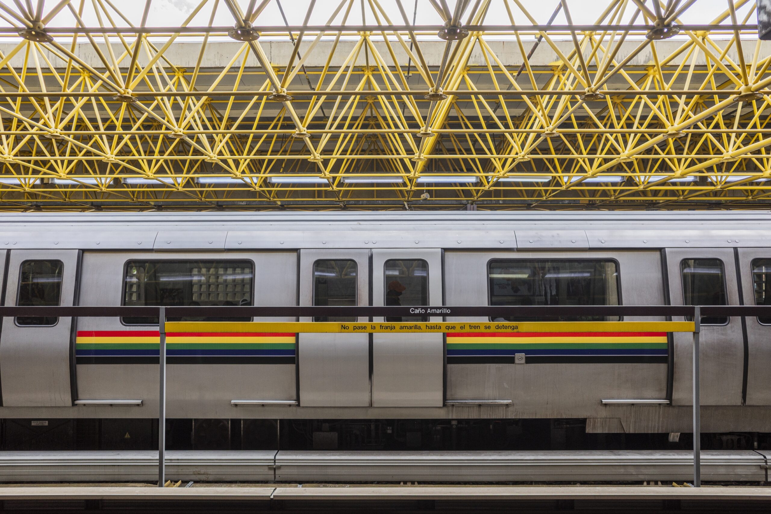
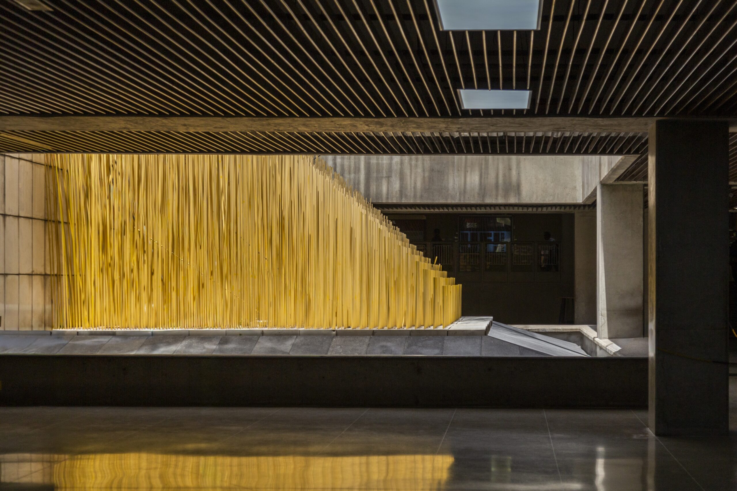
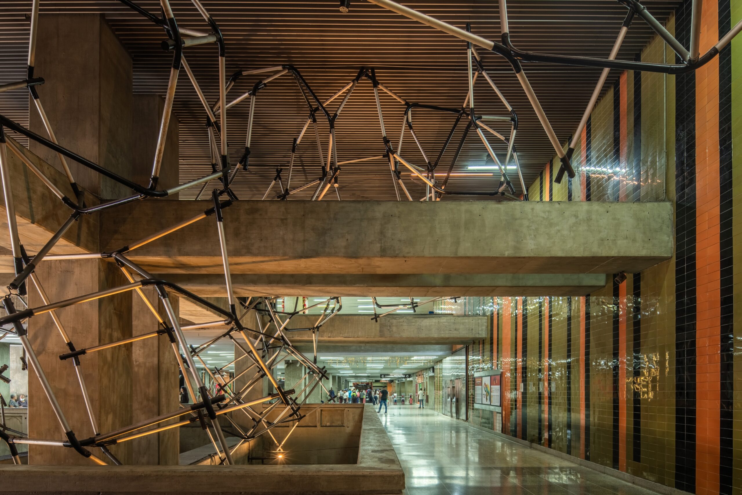
The French-built trains began circulating through enormous Caribbean stations—Mario Bemergui’s Caño Amarillo or Gustavo Legórburu’s Chacaíto—all supervised by Max Pedemonte. I highly recommend his book Rutas Paralelas; his interest in integrating art into the metro was vital. Lya Bermúdez, Cruz-Diez, Otero, Marisol Escobar, Soto, Gego, Narváez, Mercedes Pardo, Narciso Debourg, Víctor Valera, Belén Parada, Beatriz Blanco, Colette Delozanne, and Harry Abend give identity to these modern public spaces. Ultimately, the Caracas Metro was so beautiful that a weekend plan could simply be: seeing the stations, eating, going to the movies in La California, having ice cream in Bellas Artes, shopping at La Hoyada market, or visiting your girlfriend in Petare before heading back to Mamera. In the 80s, it felt like playing tourist in the Moscow Metro, but with sunshine and macaws resting in the samán trees.
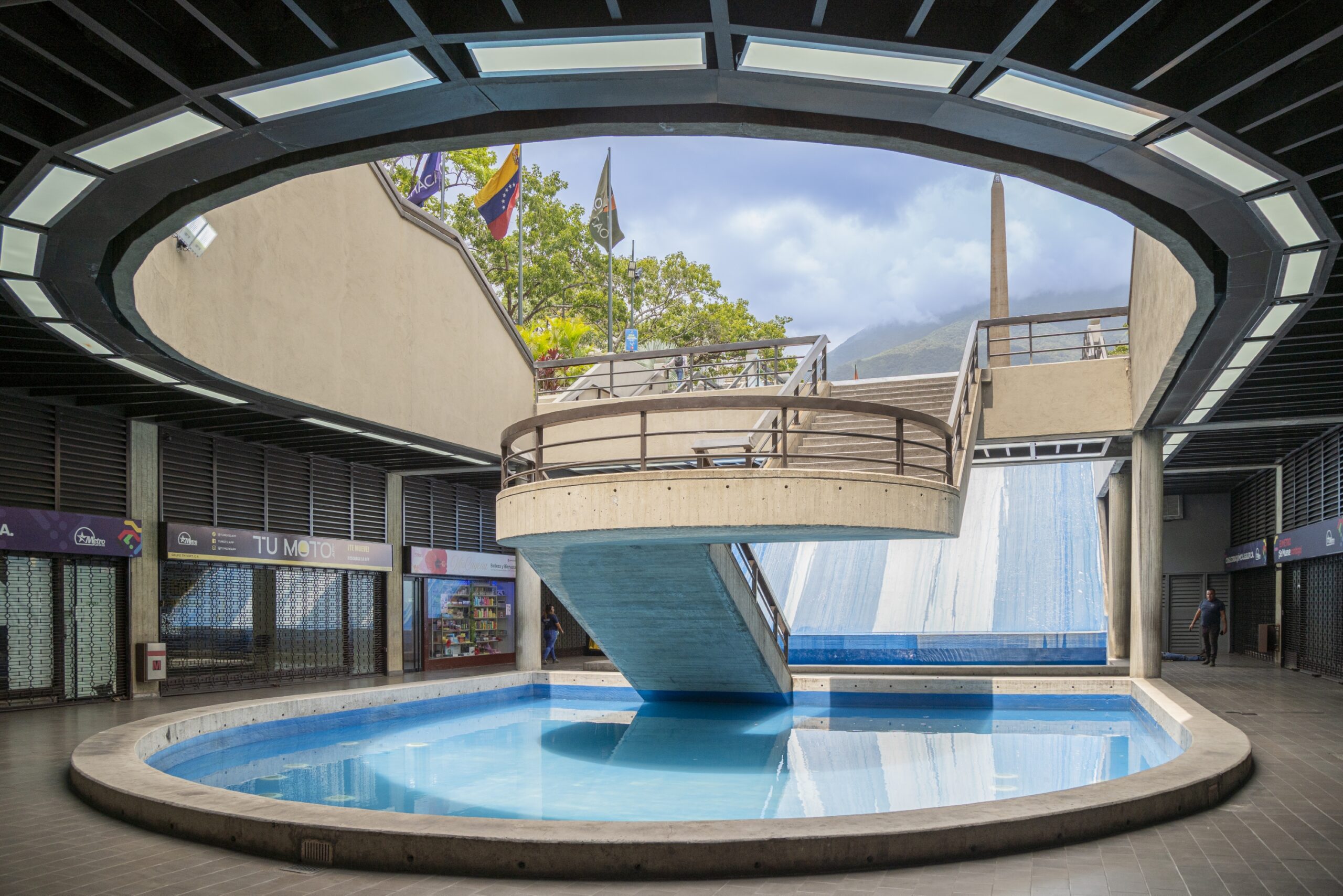
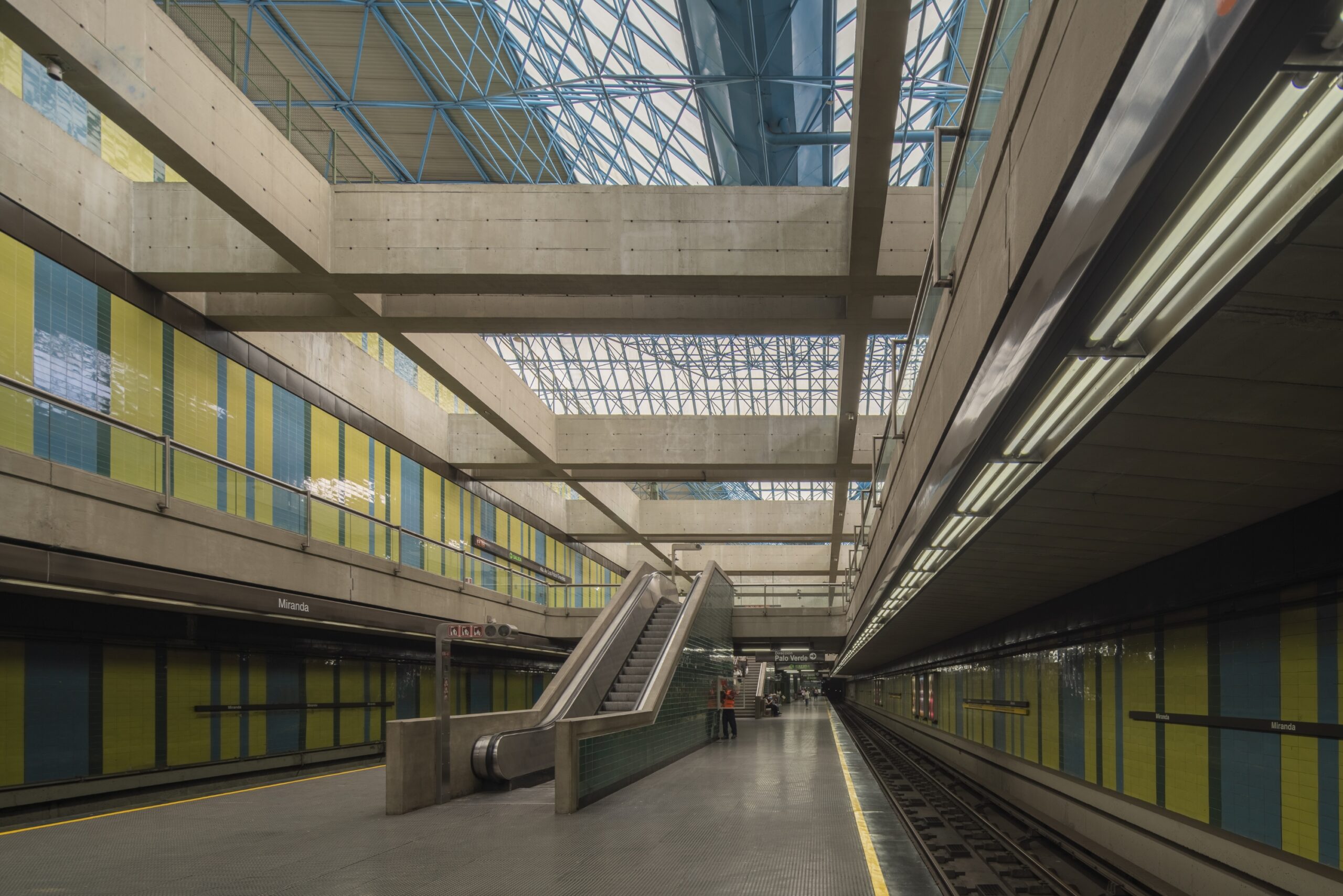
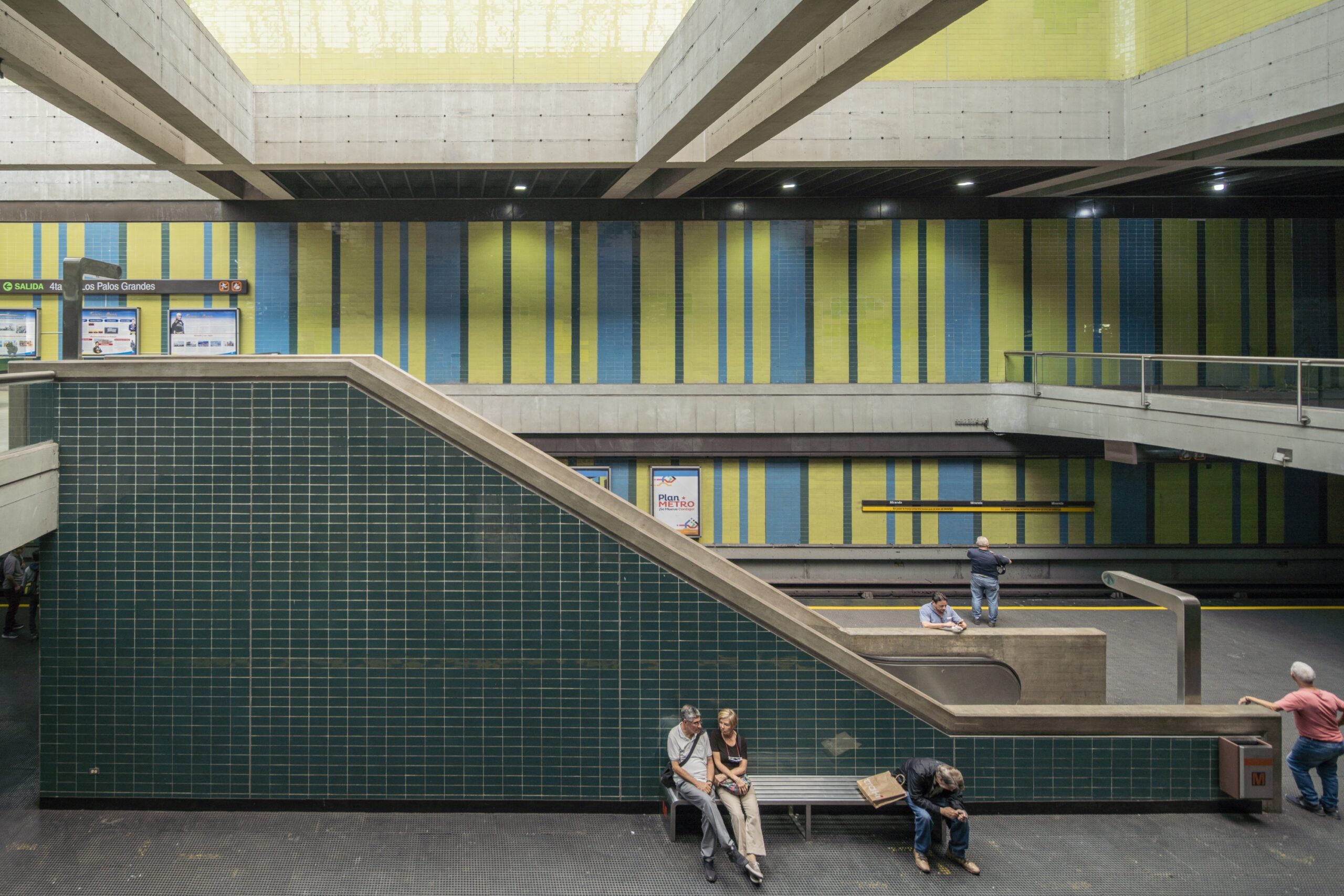
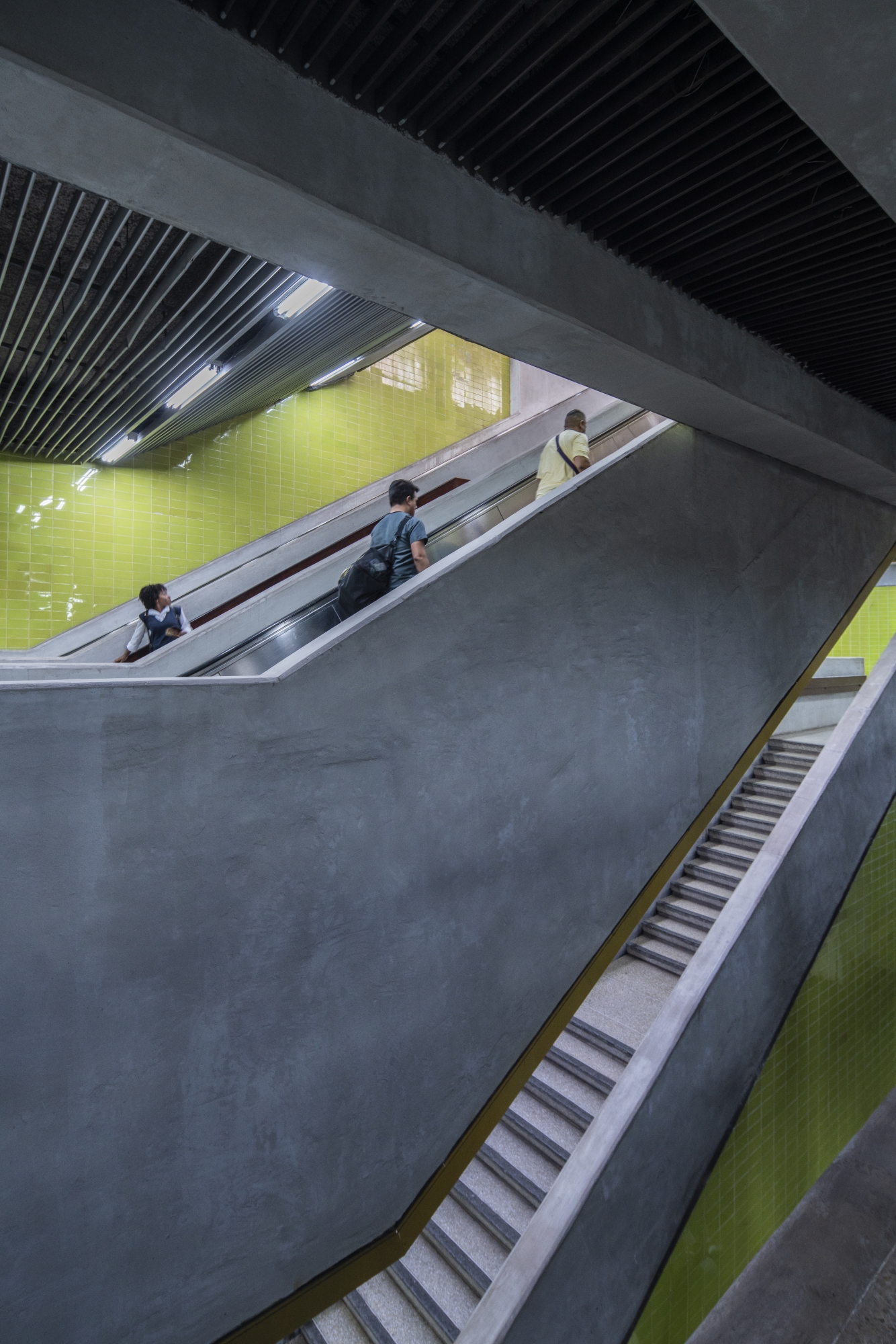
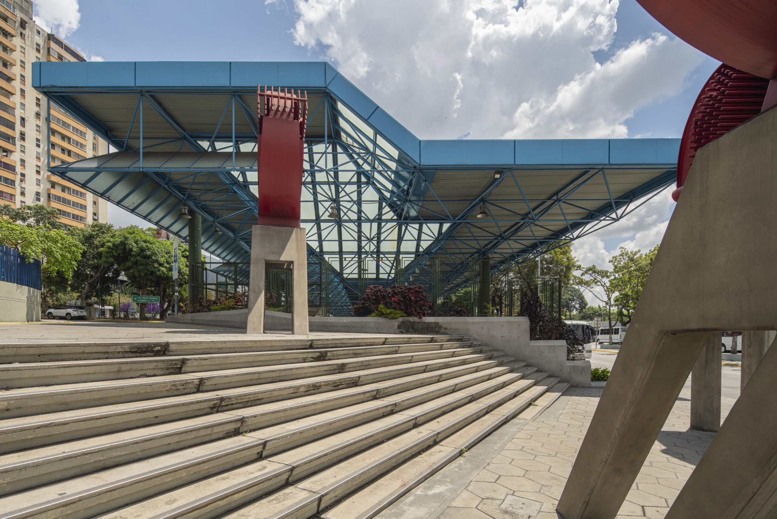
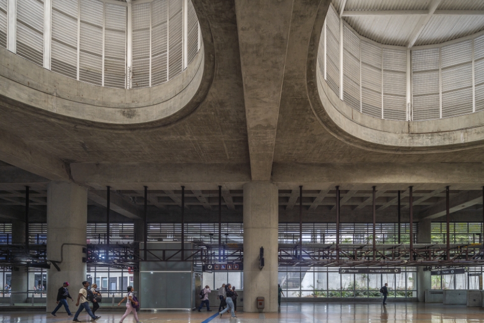
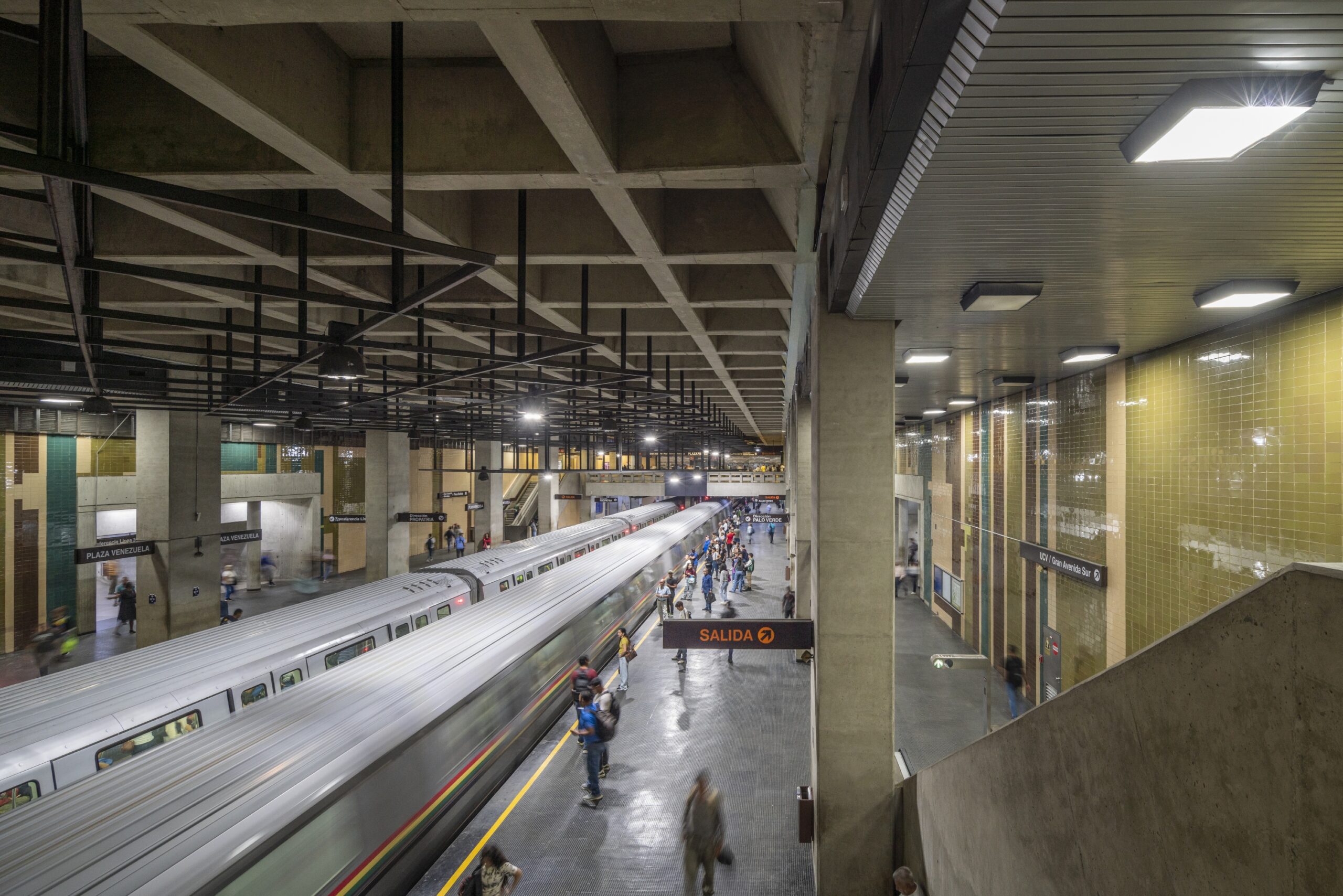
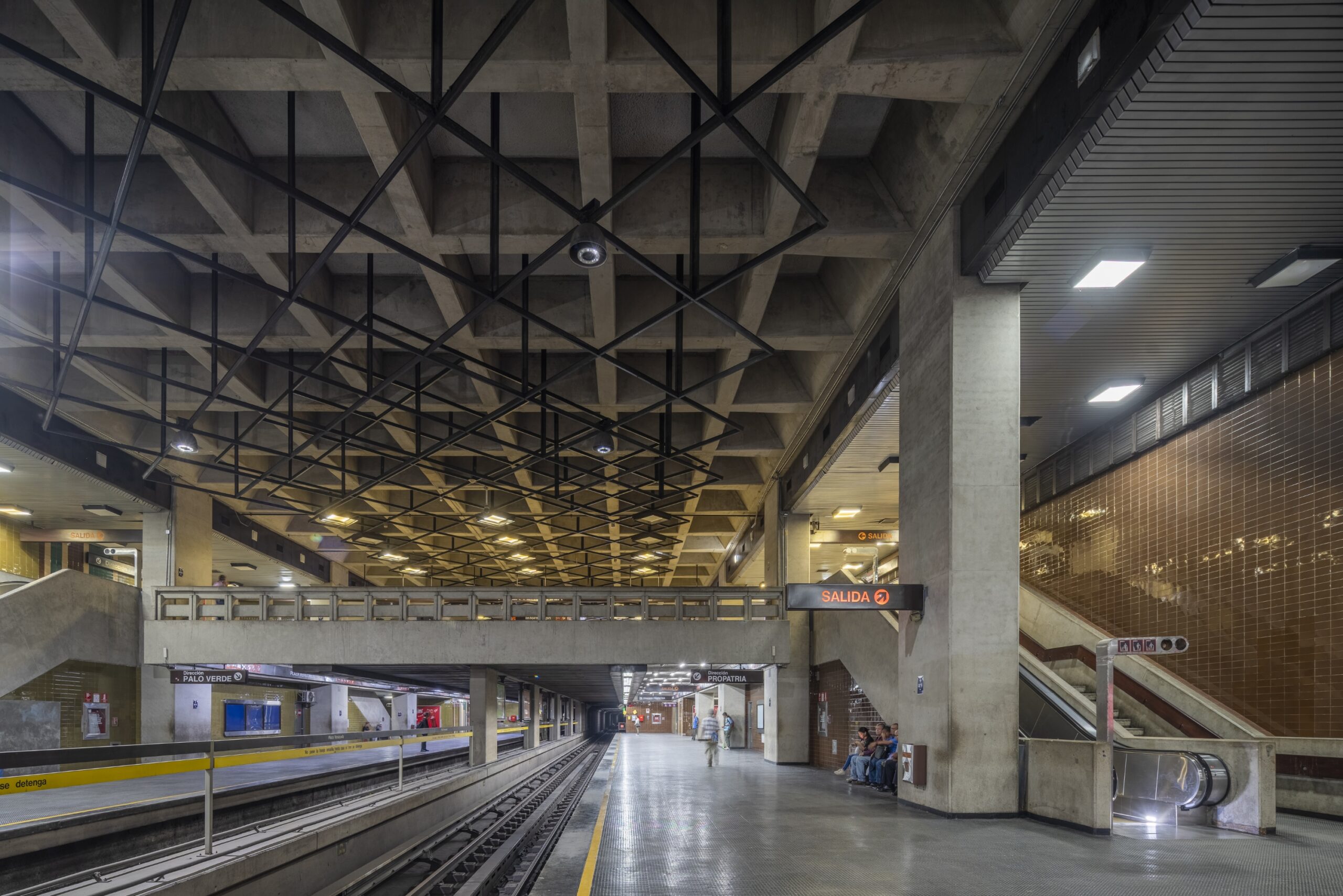
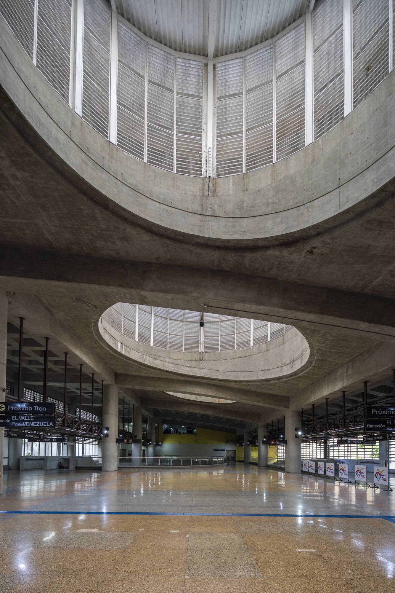
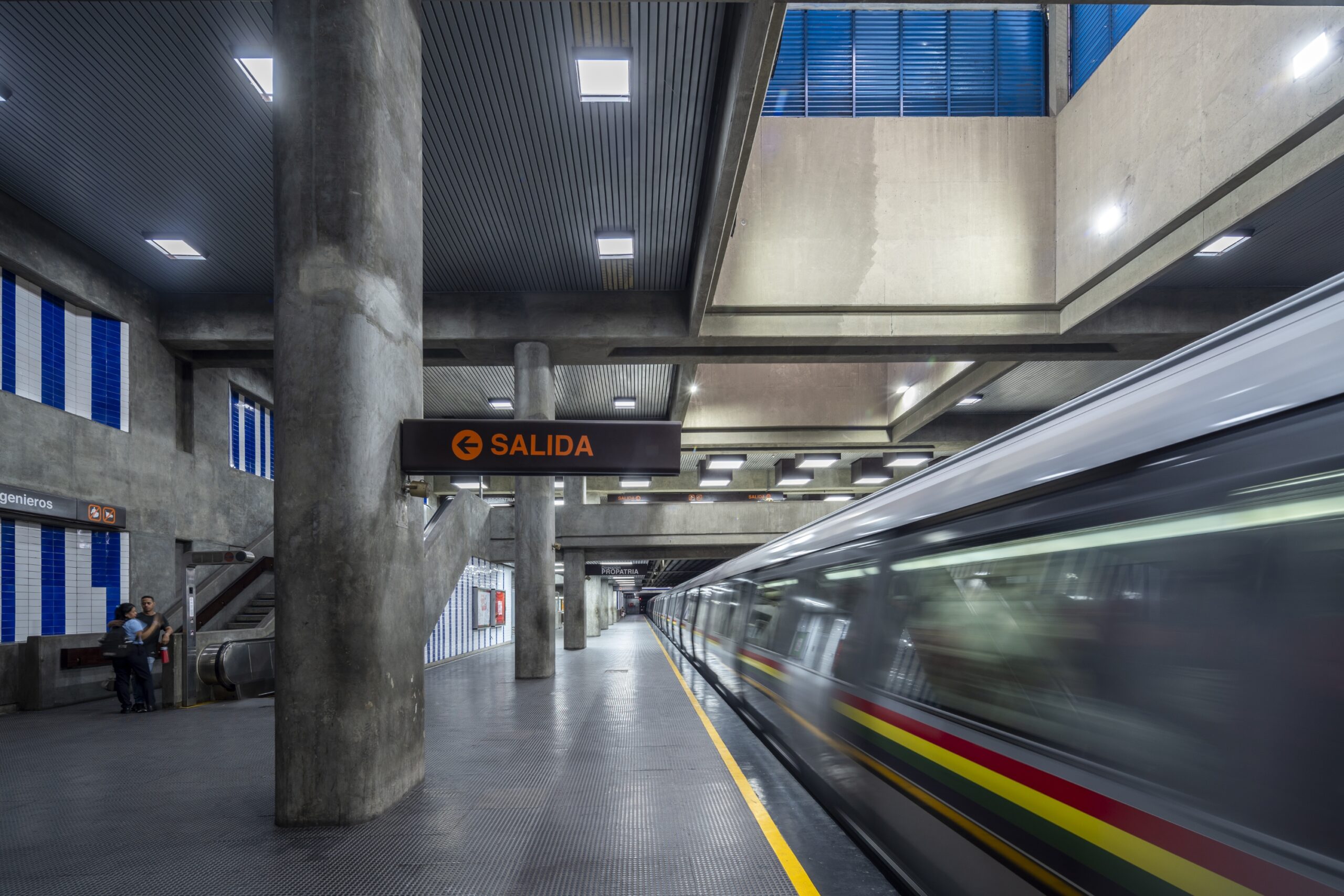
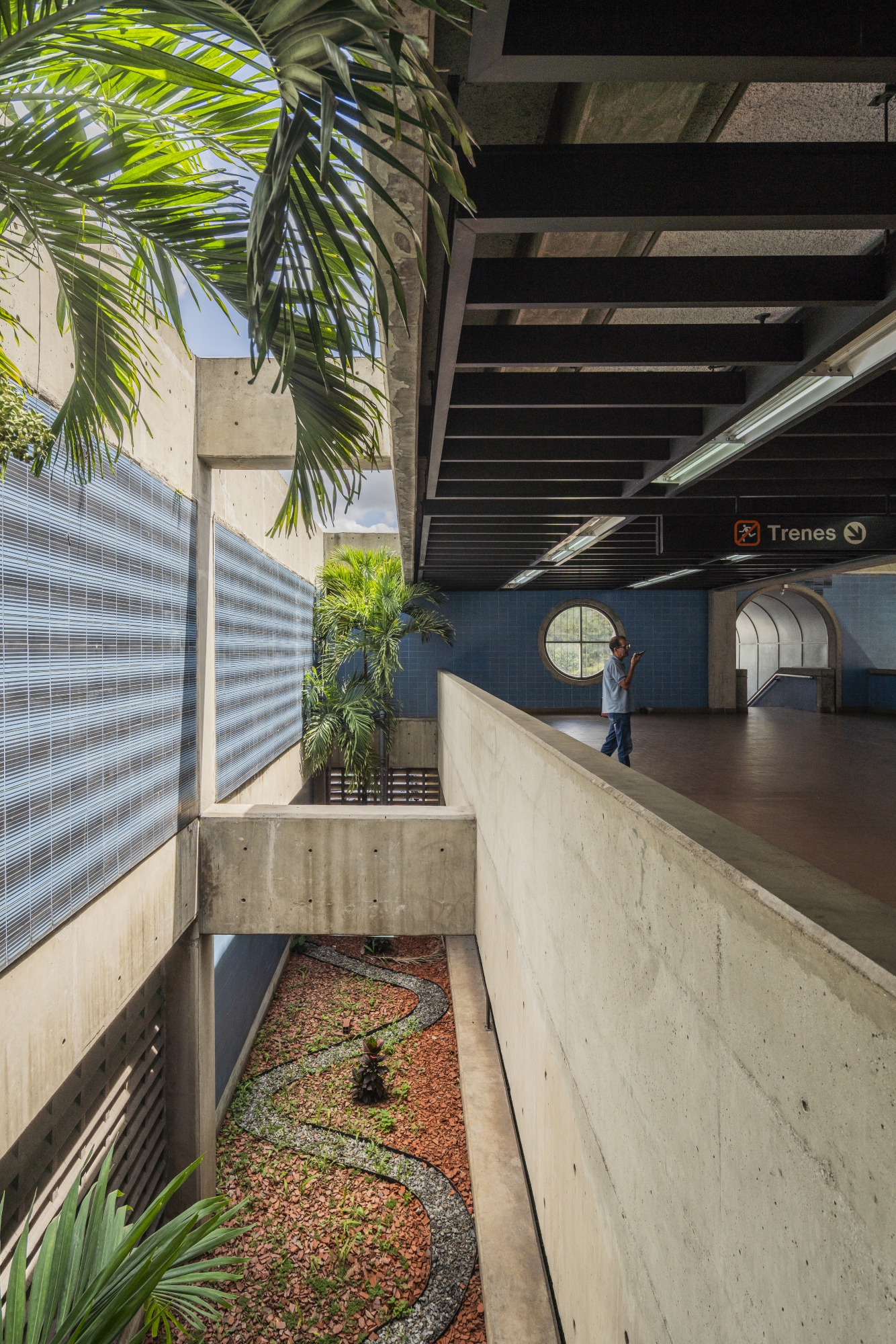
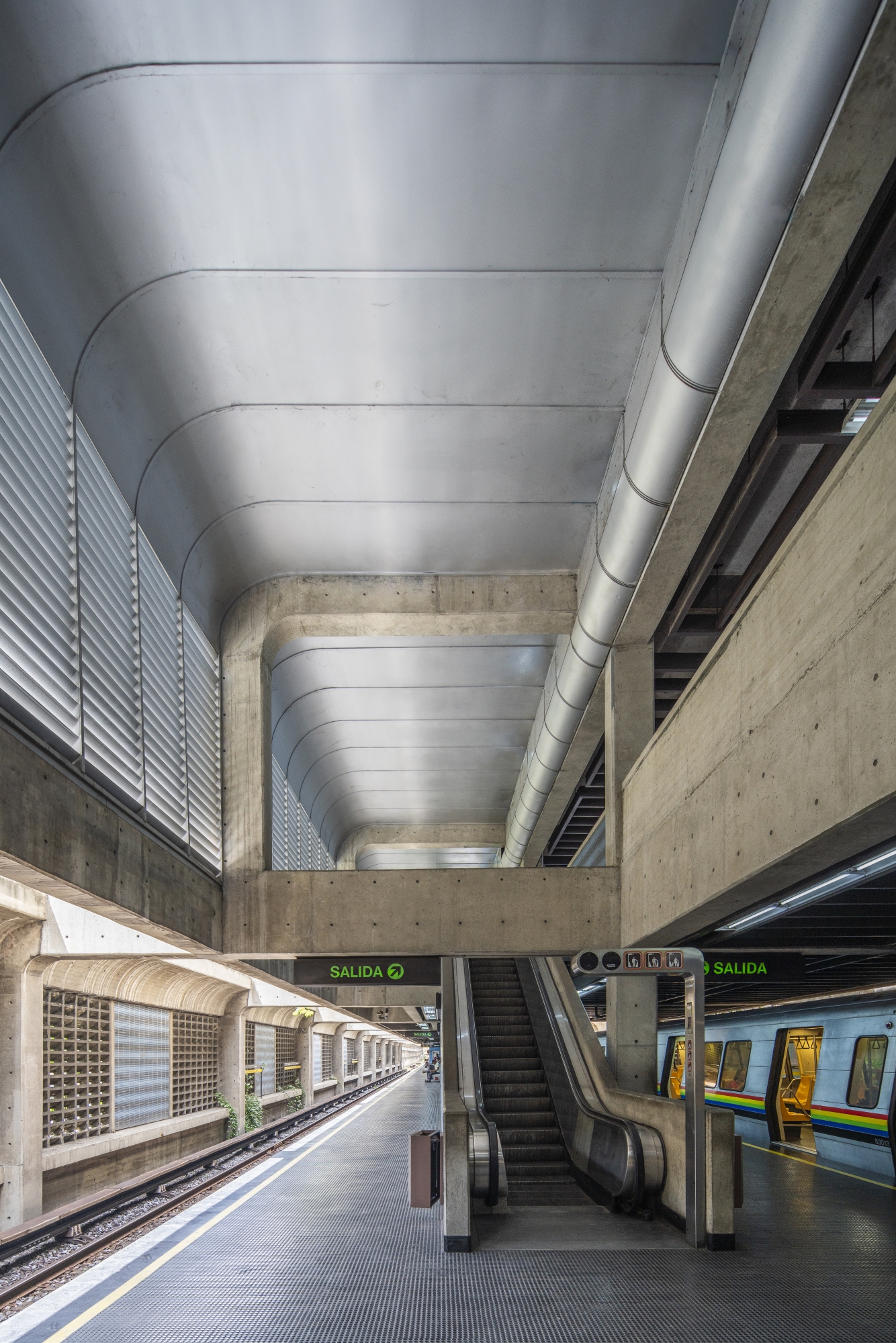
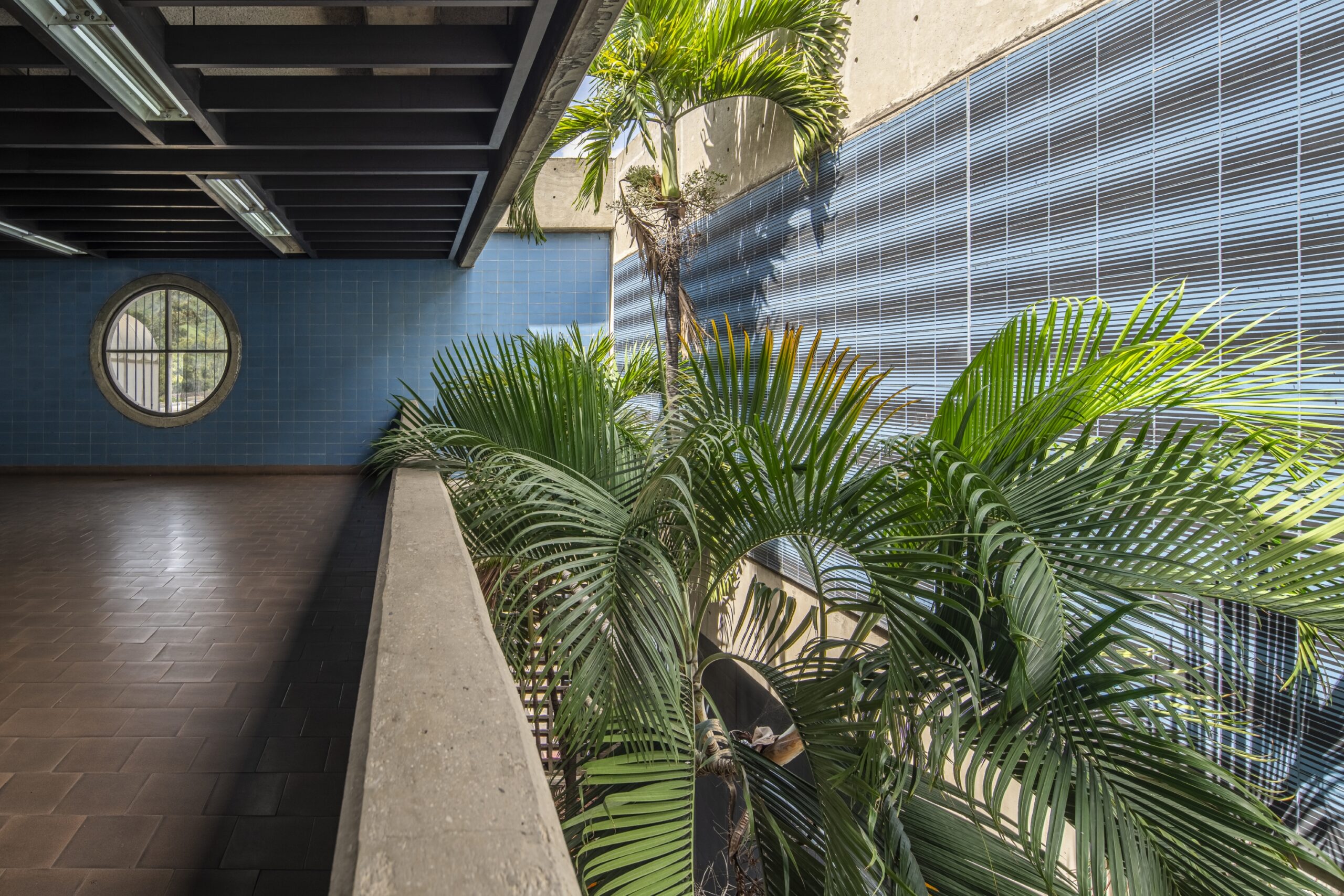
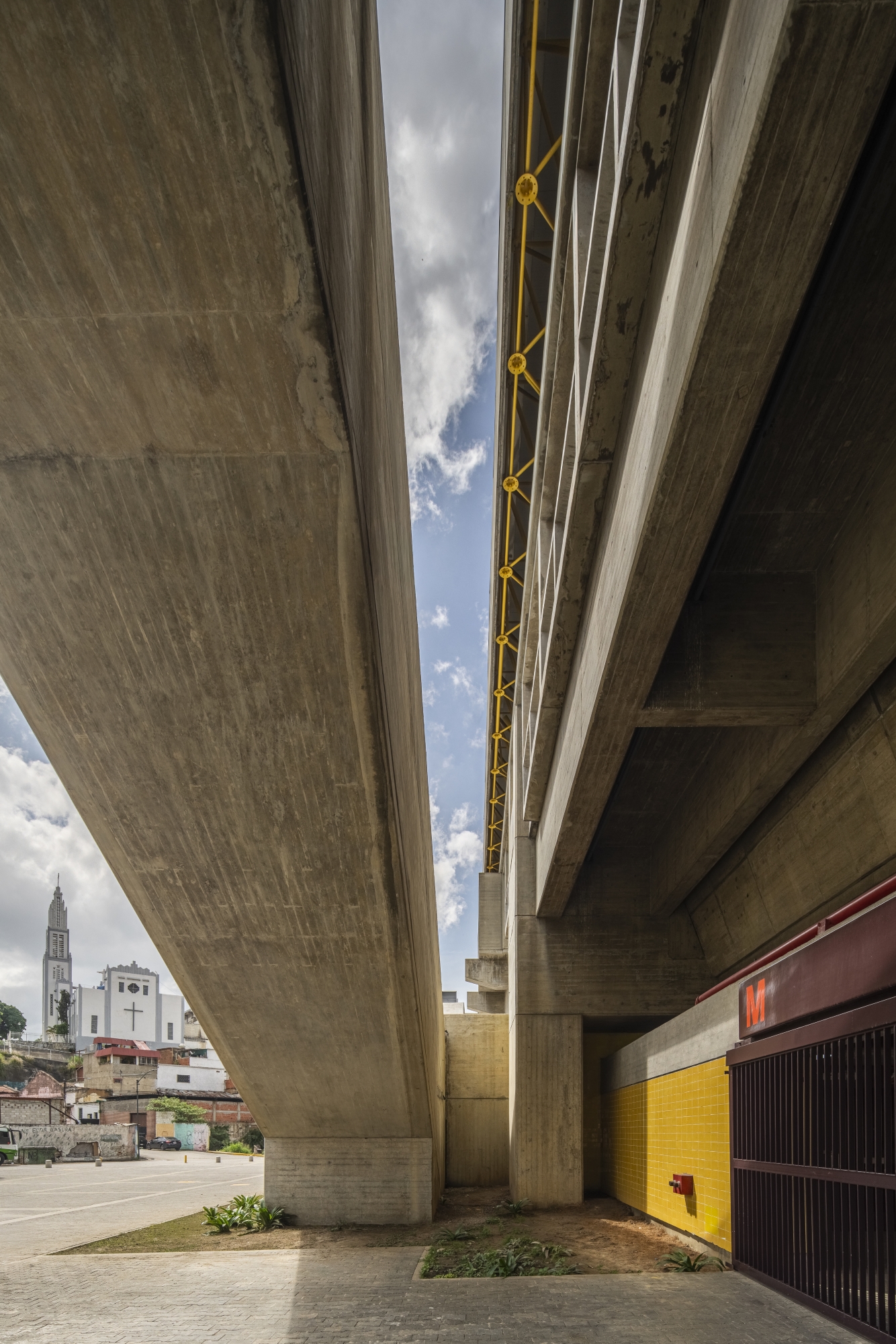
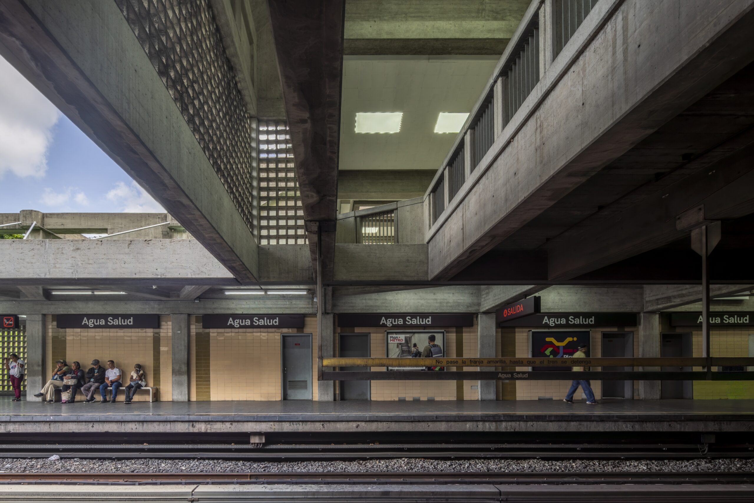
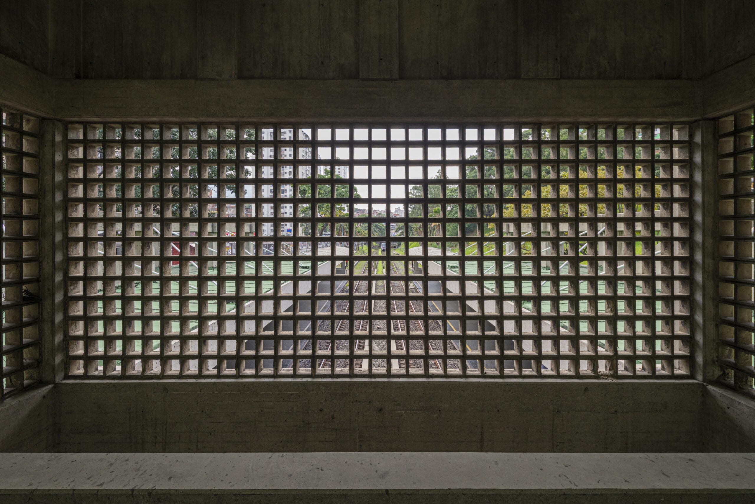
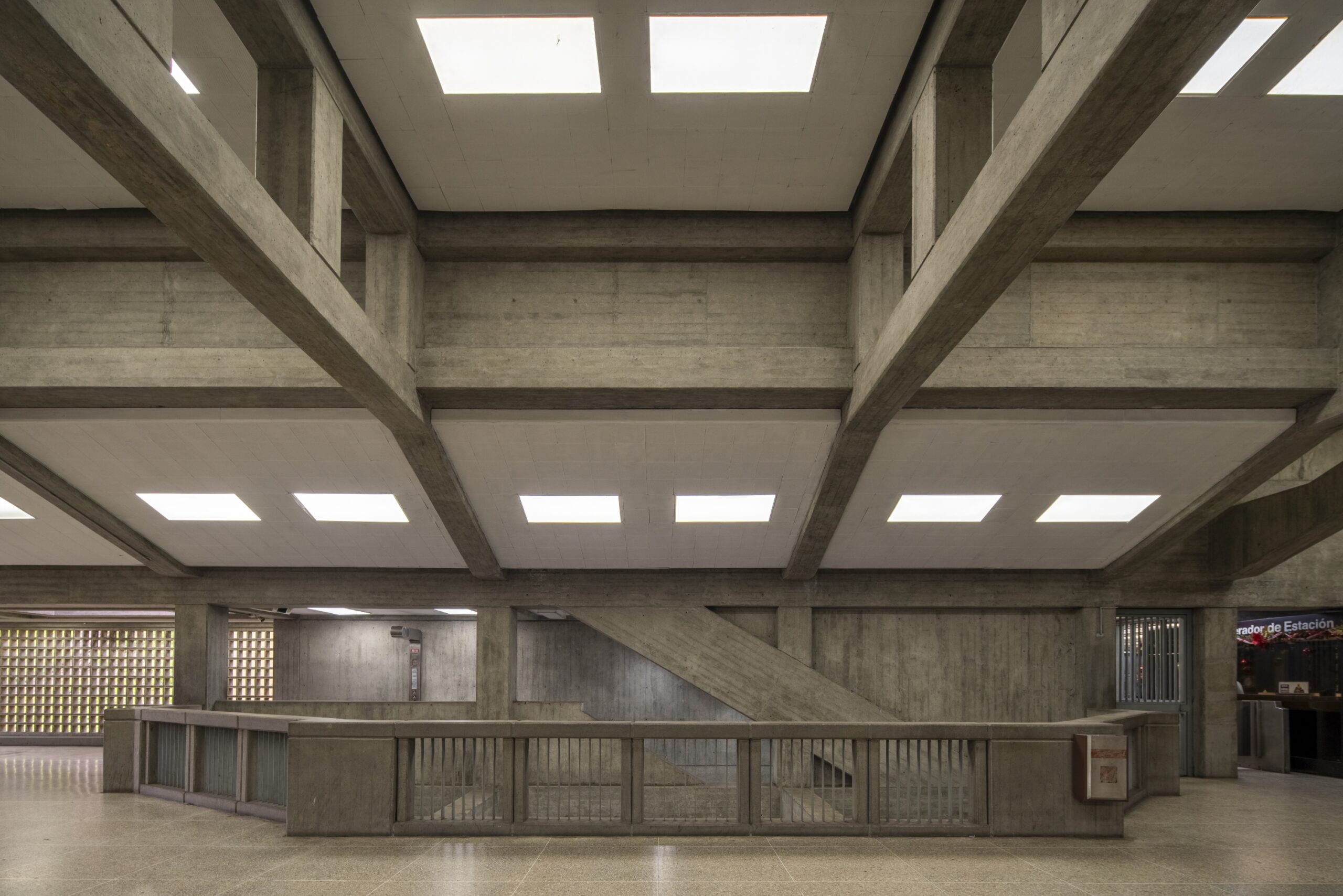
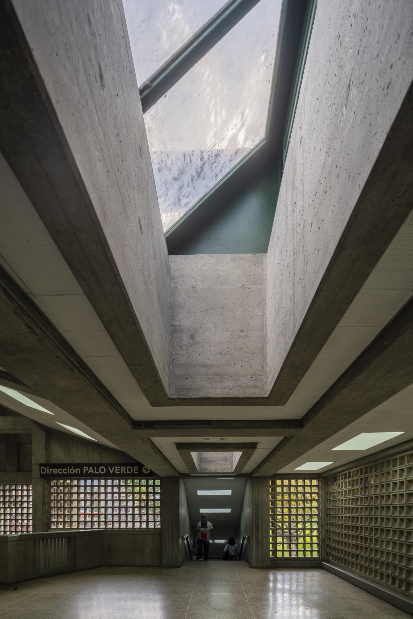
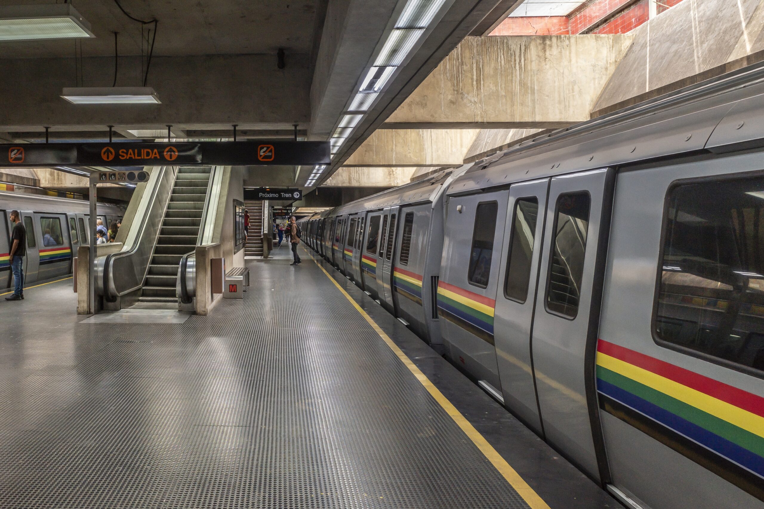
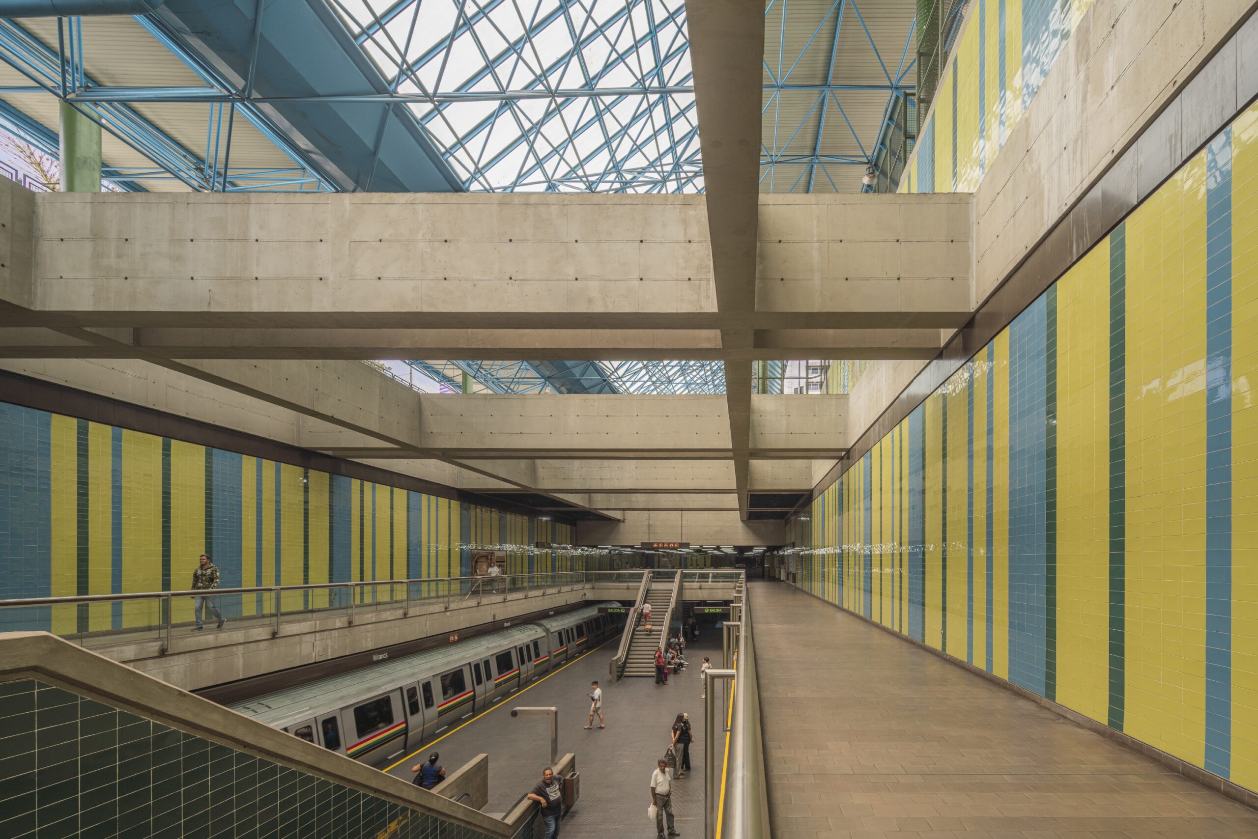
There are many accounts regarding the chromatic study of the station walls and its gradation along Line 1: fruity tones in La California, the freshness of Petare, the greens stretching from Los Cortijos to Parque del Este, the blues shared by Chacao and Altamira, or the jungle-like duo of Plaza Venezuela and Sabana Grande. Due to their cut-and-cover trench construction system, these two stops are connected by a gallery above the tunnels, which was never opened to the public. This invites one to imagine extensions to the system. The volume of excavation and the subterranean voids are staggering. In other older metros and more recent networks, the design holds domestic proportions; in Barcelona, at Plaça de Sants, you almost hit your head, and two people can barely pass each other on the same staircase. In contrast, the abundance of double-height ceilings makes the Caracas Metro monumental: its brutalist generosity is embedded in the DNA of Caracas’s public spaces.
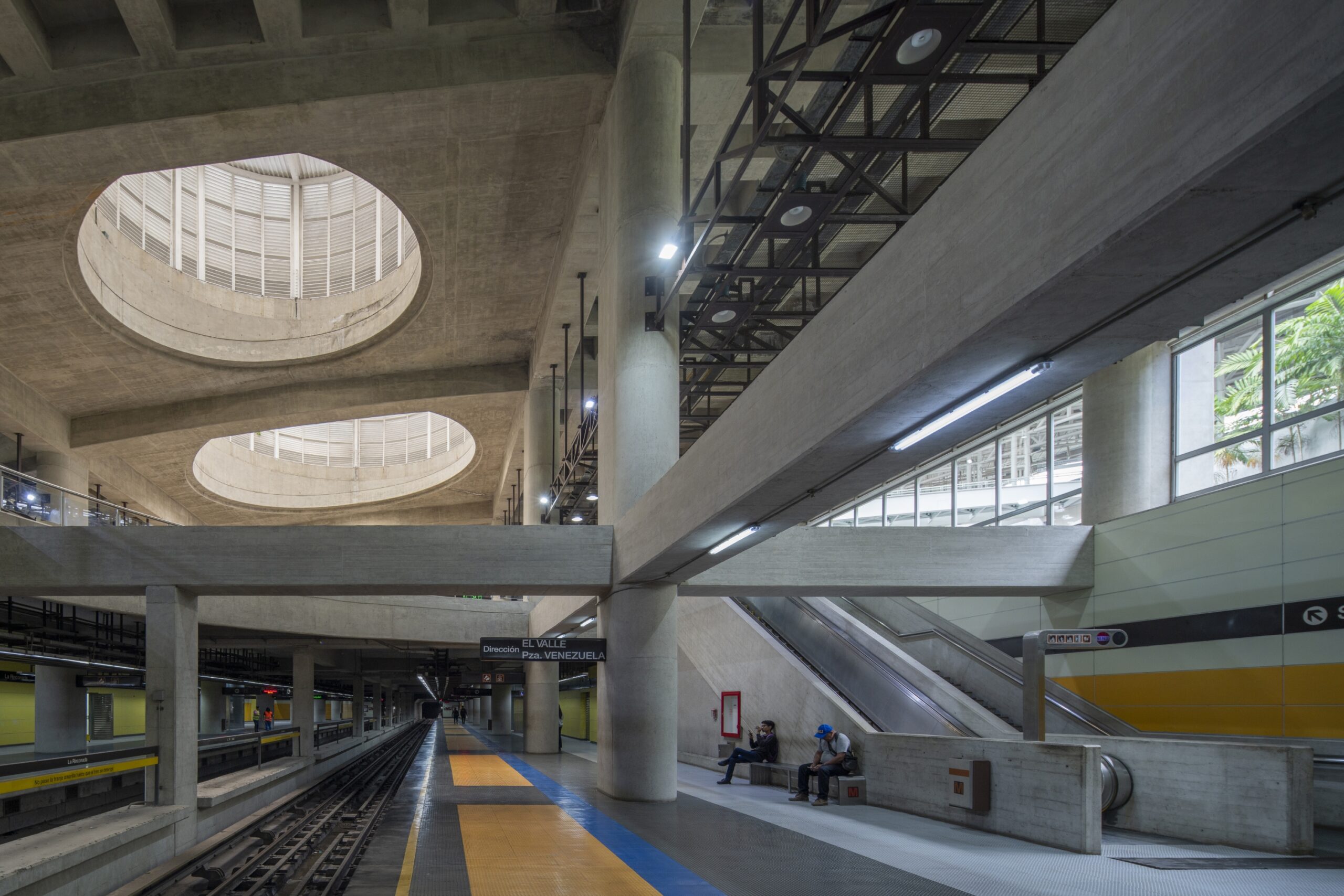
Line 5, projected in parallel to Line 1, would have had a completely different life, as would the branch to La Trinidad or El Hatillo. Early maps even show the idea of a link between Caricuao and La Rinconada—incidentally, the last major station of the system, inaugurated in 2008. New York has 472 stations and 284 escalators; Caracas has 51 stations and 330 escalators. A network with such massive infrastructure is not profitable anywhere: monumental environments are difficult to finance. According to engineers, a metro should strictly be efficient at moving large masses of users; therefore, stops should be discreet, like those on Line 4, built by the Brazilians of the now-defunct Odebrecht.
Looking back at the first stations from the 80s, caraqueños are still waiting for further investment in spatial quality for this system, which feels more akin to the Parisian RER than a conventional metro. That monumentality could be leveraged for cultural uses: bicycle parking—like the impressive ones in Holland—museums like the new Colosseo station in Rome, or underground galleries serving as temples for travel meditation. This is precisely why those who work in the metro feel such pride in the system’s architecture.
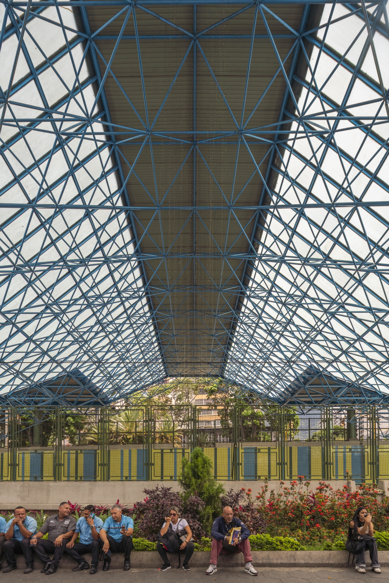
We owe a great deal to Max Pedemonte, Mario Bemergui, Siso & Shaw, Gustavo Niño, and Gustavo Legórburu. They knew how to articulate civic spaces within the valleys of Caracas: beyond boring tunnels, they designed entrances through plazas and boulevards, erecting black totems with clocks at each one; connecting these points effectively reduces the city to a pedestrian scale. A significant part of this metro culture is owed to the Catalan Santiago Pol, designer of the system’s first map in the 1980s, a diagram inspired by Harry Beck—our own caraqueño Vignelli. The lines are identified with orange, yellow, blue, and green, colors that run along the silver train cars and accompany an orange Helvetica ‘M’, like an elegant, suited torso that conveys serenity and respect. The typography is closely related to the Barcelona metro, where TMB has maintained a standardized design for decades through manuals detailing exact tones, proportions, and a highly controlled red palette, most recently revised by Jug Cerović. In the Caracas Metro, everything was similarly regulated: white letters on a black background, orange accents, and cardboard tickets with magnetic strips, very similar to those used in Paris.
Today, the system is undergoing restoration after a period of deep deterioration at the beginning of the 21st century. However, the typography and map design no longer seem to be a priority, projecting a naive attitude toward the technical magnitude of such a vast network. Several stations have been intervened without any architectural criteria: in Petare, the space was recovered, but the planters were covered with green carpet; at Colegio de Ingenieros, the concrete was painted over with adhesive; at El Silencio, poorly placed Alucobond patches have appeared. Even so, discreet architectural jewels like La Paz or Caño Amarillo survive. Now there are new benches and charging stations, but they feel entirely alien to the original design. It reminds me a bit of Madrid, where the metro’s graphic identity is far more heterogeneous: renovations have produced design contradictions and the coexistence of multiple typographies. The overall aesthetic is perceived as more disordered and less graphically consistent, although it maintains a strong construction standard and a level of maintenance that keeps the city’s human arteries running efficiently.